Greg Carbin, Warning Coordination Meteorologist at the Storm Prediction Center (SPC), informed me today that he has updated the SPC tornado database up through 2010. Thus, in the coming days, I’ll updated the graphics to include the last 2 years worth of tornadoes. I look forward to playing with the updated data!
March Tornadoes
After a long hiatus from blogging for most of February, I’m back at it as things appear to be slowing down just enough to let me have coherent thoughts again. This is fortunate since we’ve entered a new month and I need to post the March tornado graphics! This post should do the trick!
March Averages (based on data from 1950 – 2009)
60.63 tornadoes (3638 total)
186.1 injuries (11166 total)
12.93 fatalities (776 total)
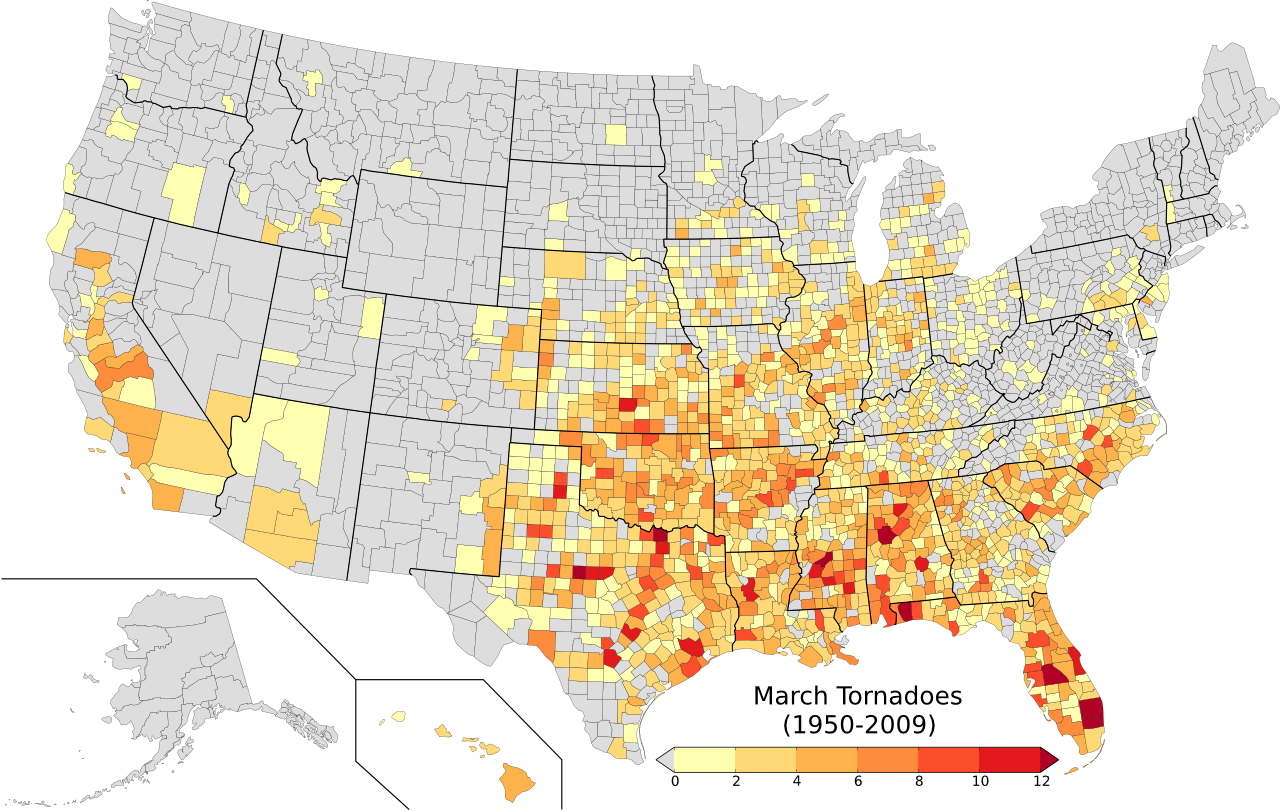
Above is a choropleth map of tornadoes by county. As we head into spring, warmer temperatures and more moisture begins making its way farther north and west than January and February. This allows for surface-based thunderstorms to develop farther north and west, and consequently we see a considerable expansion north and westward in the number of tornadoes. However, numerous tornadoes have been reported in the central valley of California.
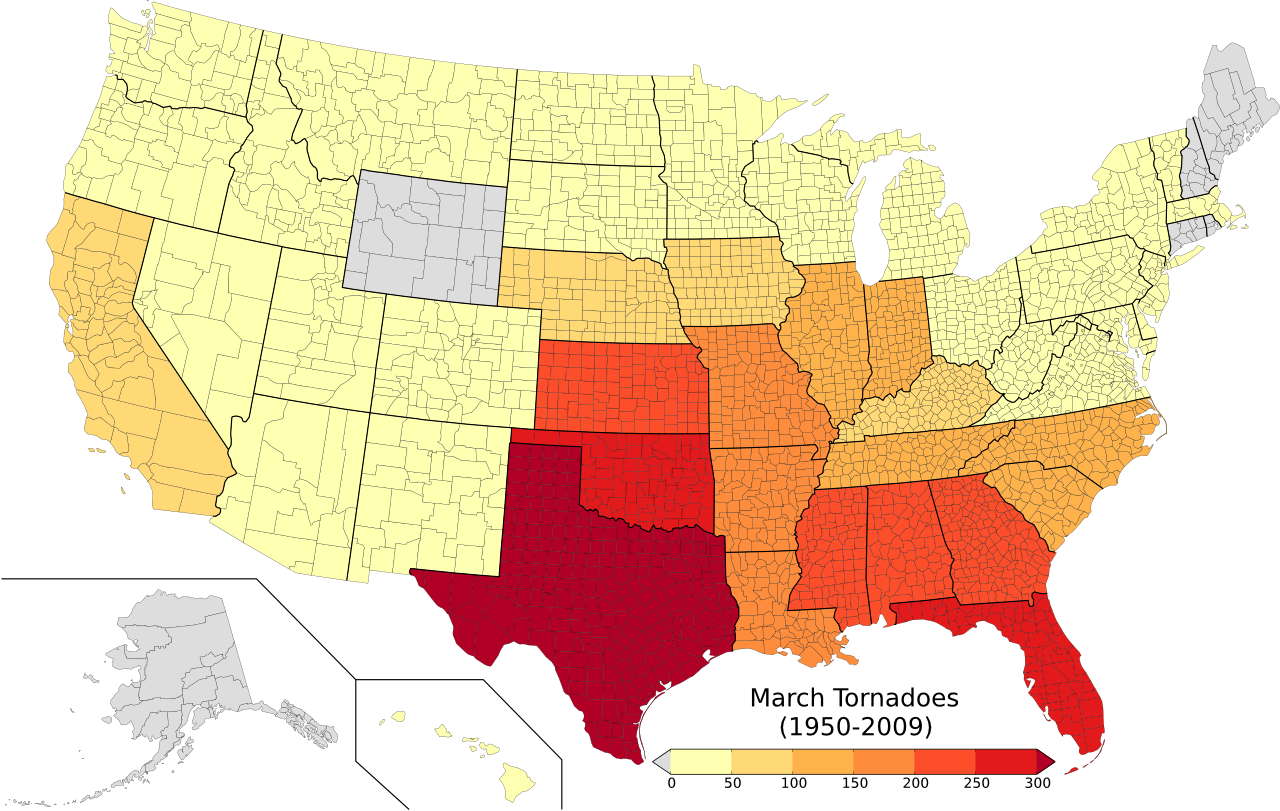
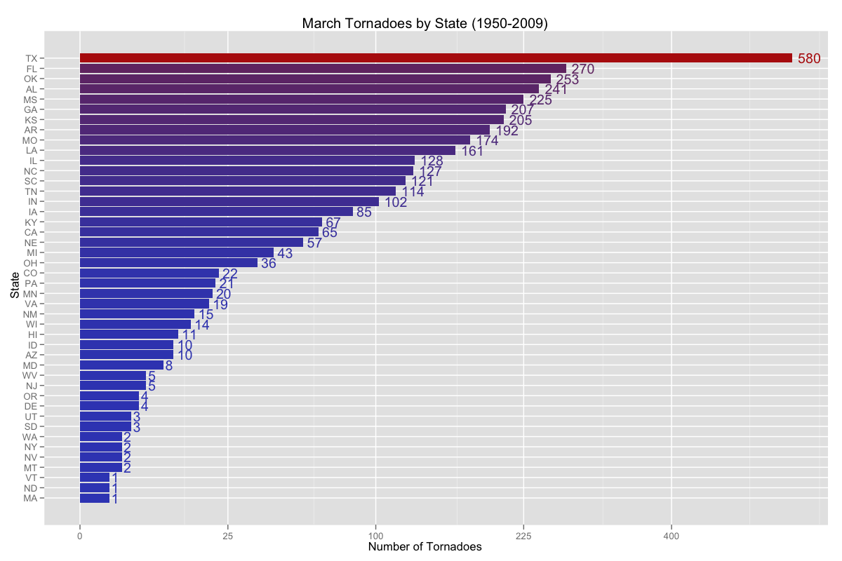
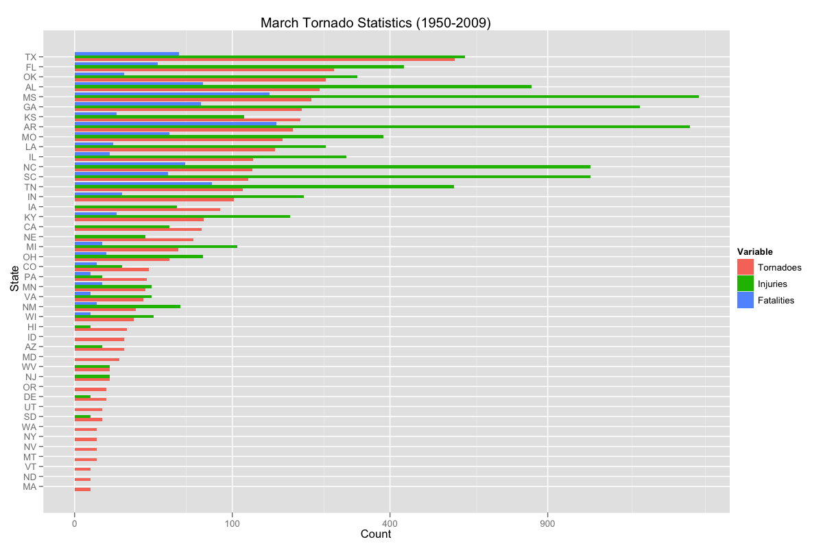
If we break the tornado numbers down by state, we can see that Texas is the big winner (or loser depending on your point of view), with the other southern plains states having high numbers of tornadoes. The southeastern states have little change with the February numbers, making this area one favored area for tornado development.
The actual counts by state are broken down below.
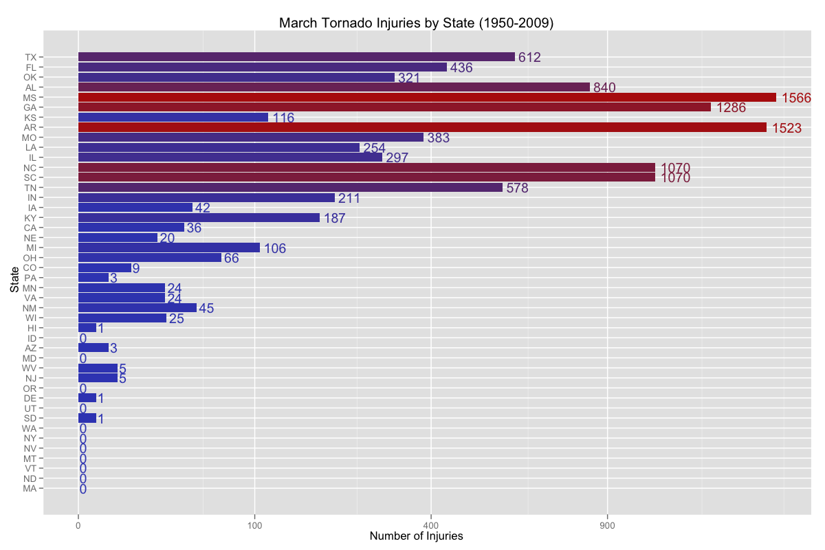
What about injuries? Keeping the same state ordering above (namely, in decreasing order of tornadoes), we can see the breakdown of injuries by state. For the third month in a row, Mississippi leads the nation in injuries, with Arkansas not far behind.
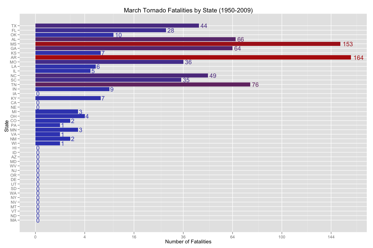
Examining the number of fatalities, Mississippi no longer leads the nation. Arkansas has the most number of March tornado fatalities, thanks in part to the 1 March 1997 tornado outbreak.
Lastly, here is a summary figure combining the last three figures.
February Tornadoes
Since I forgot to post a this week due to continued winter weather, and because the snow battered center of the United States has begun its long awaited warm-up, I thought I’d go ahead and share the statistics and figures relating to February tornadoes. The plots and statistics are similar to those I computed for January that can be found in posts here and here.
February Averages (based on data from 1950 – 2009)
24.5 tornadoes
128.3 injuries
10 fatalities
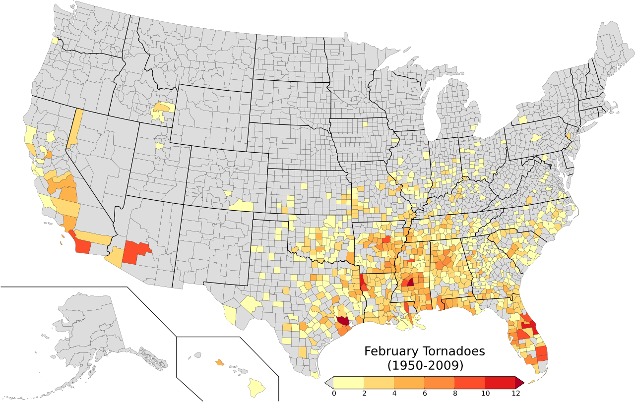
Above is a figure depicting the number of February tornadoes per county for the years 1950 to 2009. Most tornadoes tend to occur in the southeast United States, however tornadoes have been reported as far west as California and Hawaii, and as far north as Oregon and western New York!
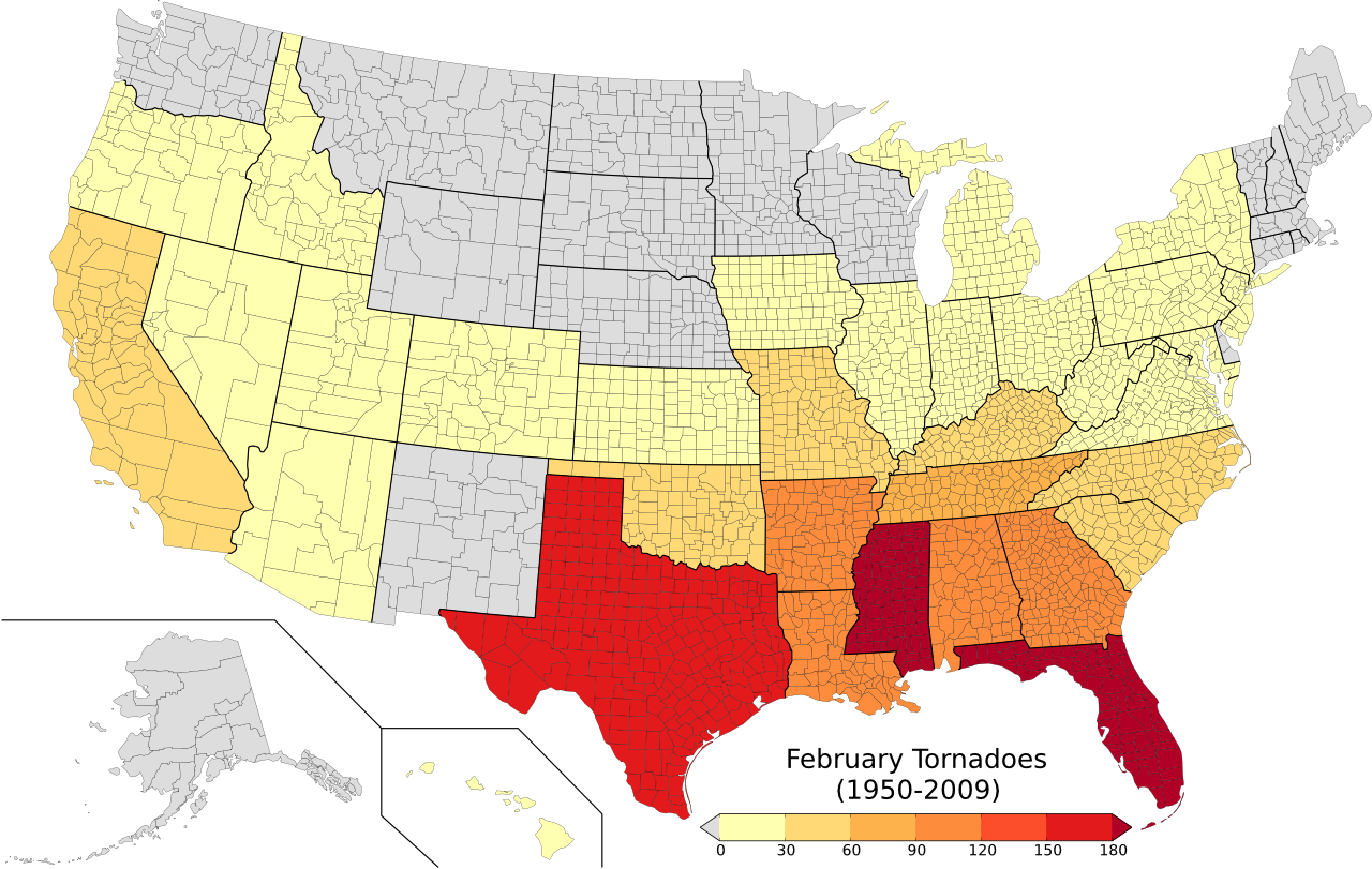
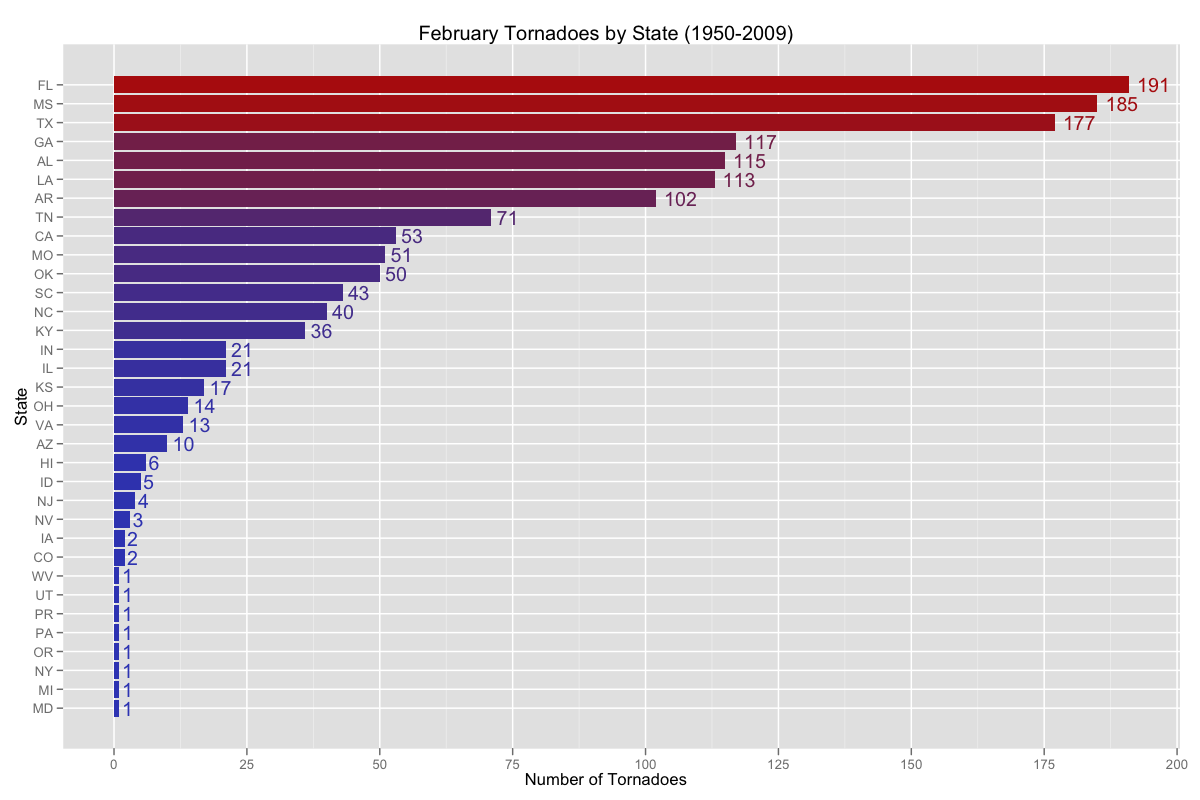
If we sum up the number of unique tornadoes from the country data and turn it into the number of tornadoes by state, it would look like this:
Florida and Mississippi lead the way with over 180 tornadoes, followed by Texas and then the rest of the southeastern states. Breaking down each states numbers, the tallies look like this:
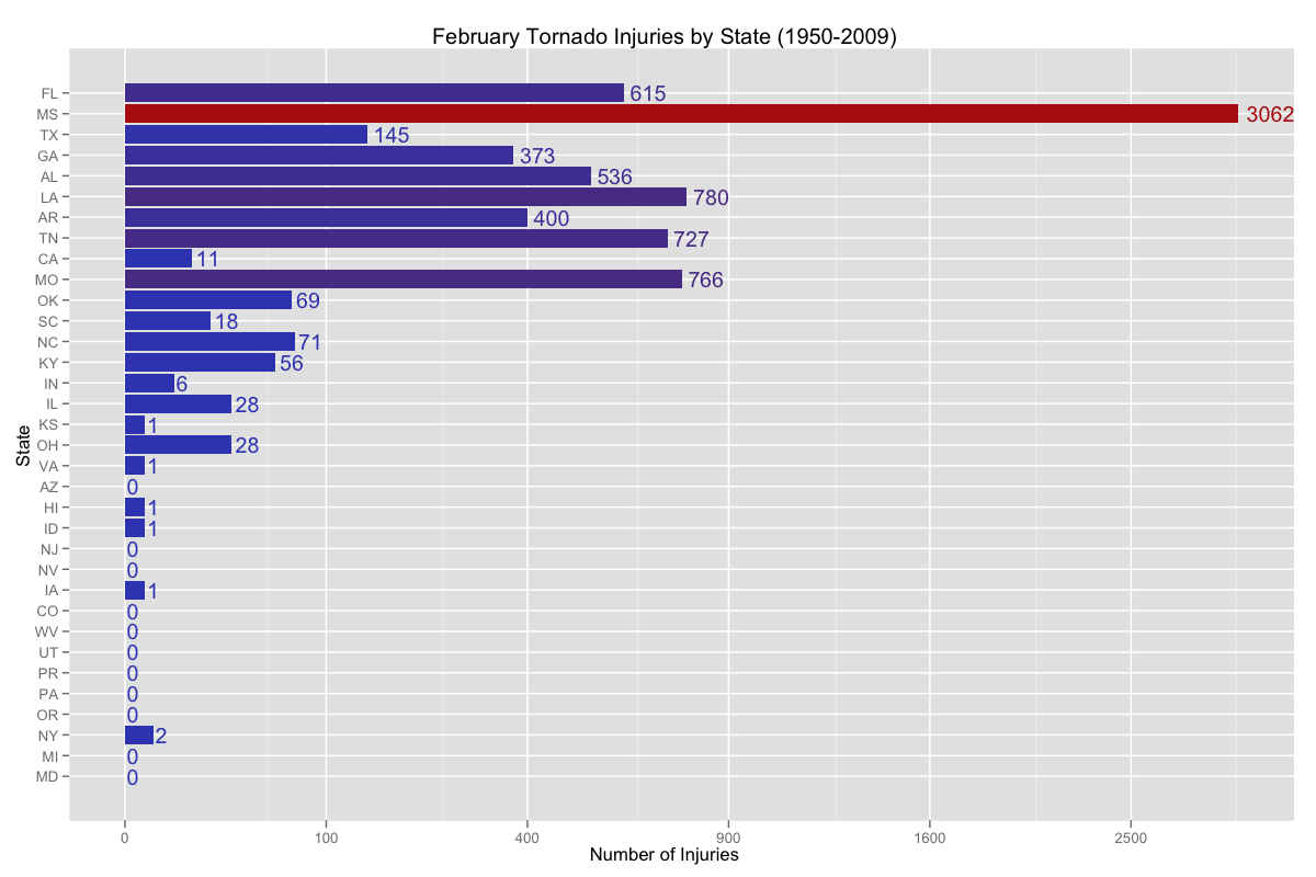
Now, the number of injuries per state break down as follows (please note the order of the states listed on the left is in descending order of number of tornadoes per state):
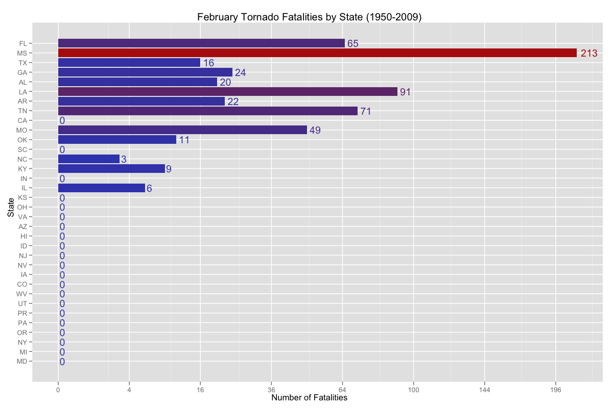
The number of fatalities per state break down as follows (please note the order of the states listed on the left is in descending order of number of tornadoes per state):
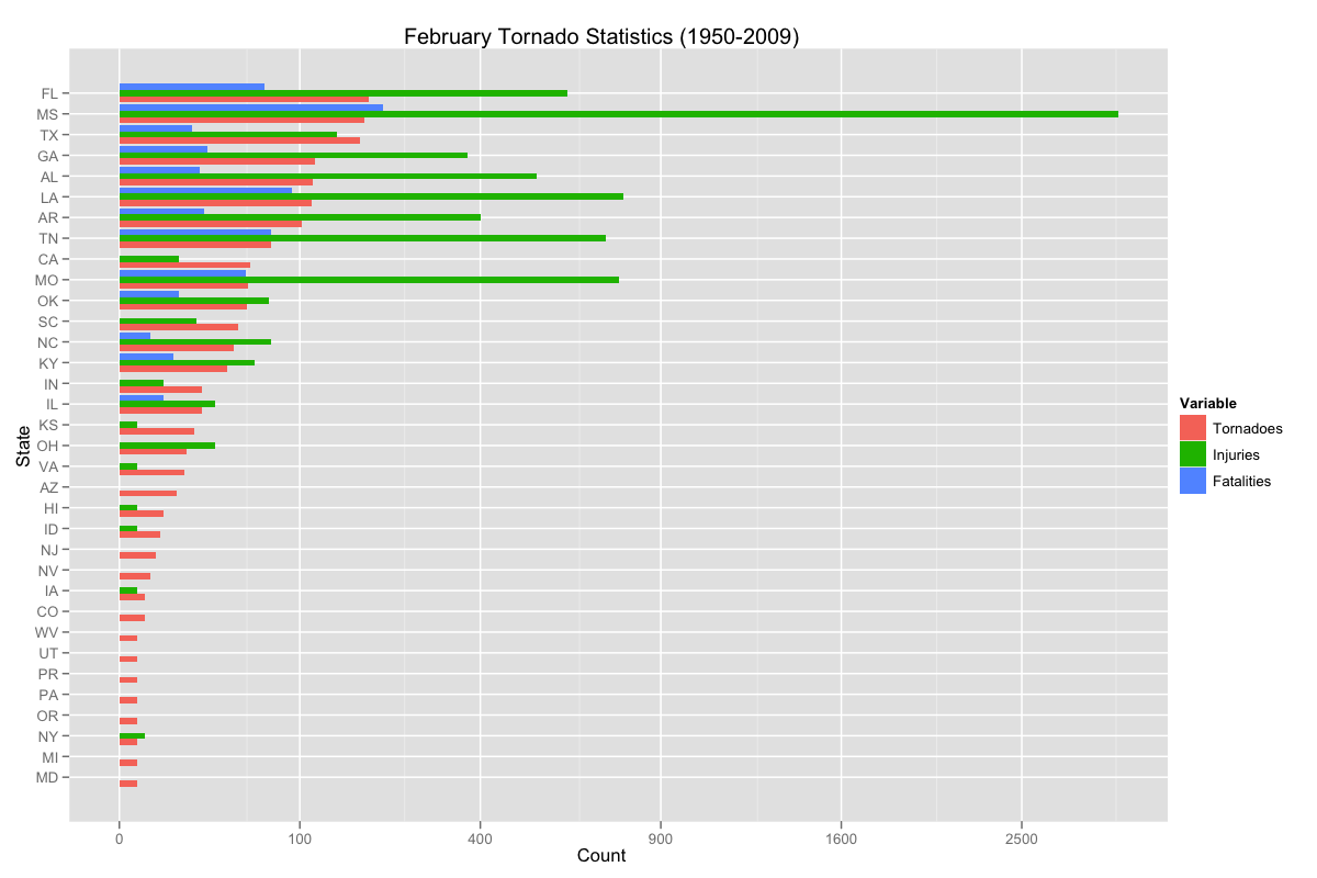
And putting everything into a single, cluttered figure, we have this:
SPC Slight Risk Climatology
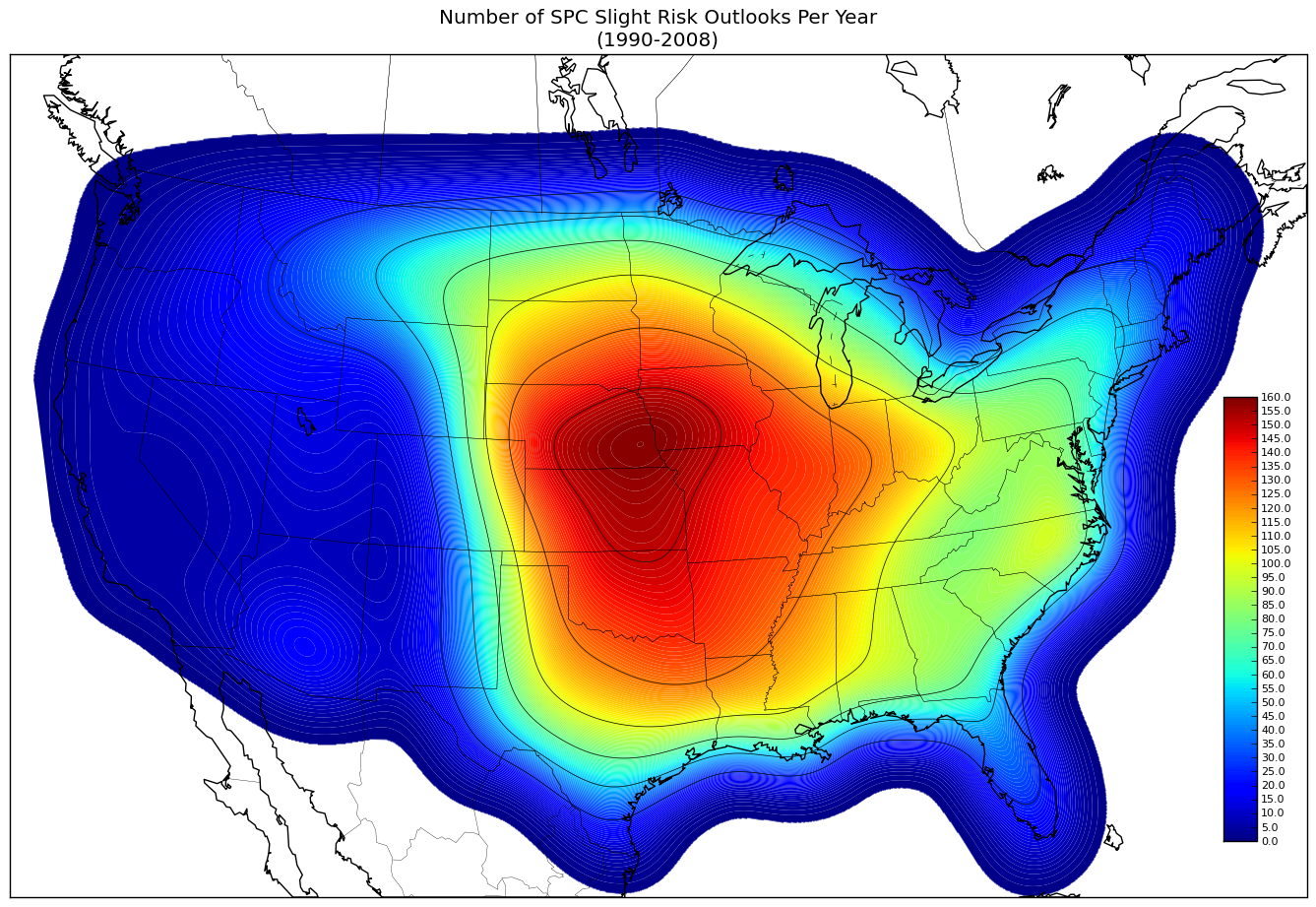
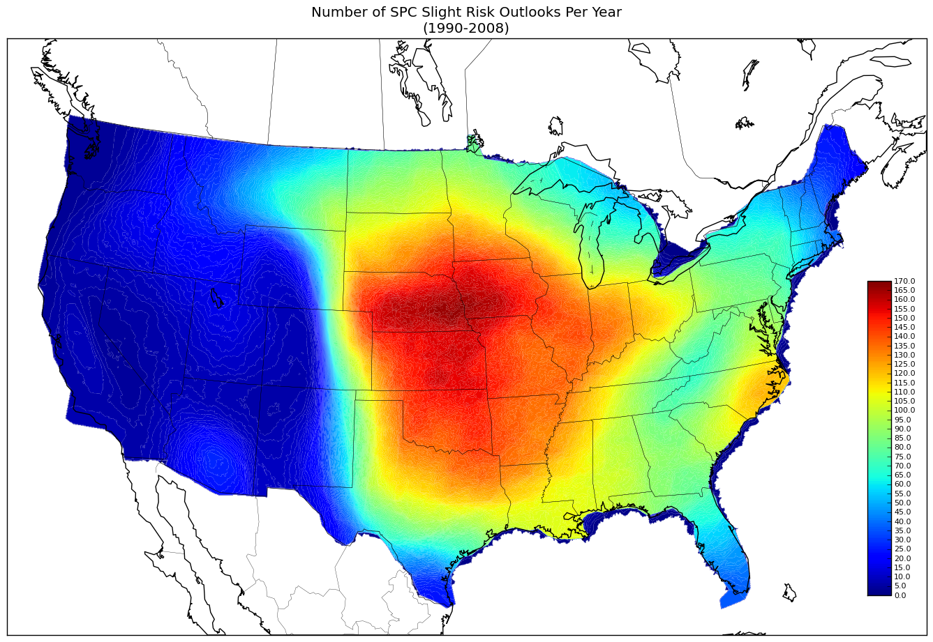
Next up in the list of Storm Prediction Center (SPC) outlook climatologies is the yearly climatology of slight risks. Between 1990 and 2008 there were 24,455 slight risk polygons issued. This does not mean there were 24,455 slight risk outlooks issued as it is possible to have more than one slight risk polygon drawn on a given outlook. Furthermore, note that each day consists of multiple outlooks and so it is possible for a grid point to receive multiple “hits” for being located in a slight risk outlook on the same day. In other words, if a location was located within 2 slight risk outlooks, this does not guarantee that two days of slight risks. The location might simply be contained within a slight risk from two separate outlooks issued for the same day.
Below is the slight risk climatology that employs the Kernel Density Estimation technique. Notice how it is smoother along the edges than the raw outlook which is located at the end of this post. The black solid lines are contour intervals of outlooks per year in steps of 25. The color fill contours are in increments of 1 outlook per year. As you can see, the central United States is once again the leader in the number of slight risks to expect per year. This has to do with the repeatability and predictability of the ingredients necessary for severe thunderstorm development. In other words, ingredients come together more frequently and more reliability across “Tornado Alley” than anywhere else in the world. This doesn’t mean that other areas aren’t prone to severe thunderstorms. Some of the largest tornado outbreaks in history have actually occurred well east of traditional Tornado Alley (e.g., 21 January 1999 and 3-4 April 1974).
Below is the raw graphic, with now Kernel Density Estimation applied. Because the edges are not smooth line, rather they are intersections from thousands of polygons, I did not plot any black line contours.
AOTW: Storm Prediction Center Moderate & High Risks
If you are coming to this page from an outside source, please see the additional two posts in this series. They can be found by clicking the following: Moderate and High Risk Climatologies and Slight Risk Climatology
Although most of the country is still digging out and cleaning up from a historic winter storm, commonly referred to as the “Groundhog’s Day Storm”, I decided to go ahead and answer the Question of the Week regarding Storm Prediction Center (SPC) Moderate and High Risks.
Before I answer the questions, first let me explain how I arrived at the answers…
I took the polygon outlining the first Moderate [High] risk during a given year, regardless of time of issuance. This means I treated a 12 UTC issuance the same as a 1630 UTC issuance and 2000 UTC issuance. I took the risk polygon, placed it on a 4km grid (specifically grid number 240), and activate all grid points that fell inside the risk polygon. This left me with a grid of 1′s (inside outlook) and 0′s (outside outlook). I created a grid for each year and then summed all the grids together. This gave me a grid containing the number of times each grid point was within the first Moderate [High] risk of the year. I then divided each grid point by the number of years I was examining. This left me with the probability that a grid point would be contained in the first Moderate [High] risk of the year.
The resulting plots were extremely blocky because of the straight edges of the outlook polygons and the relatively small size of the resulting sample size (19 years for Moderate risks and 18 years* for High risks). In an attempt to better retrieve the underlying probability distribution, I employed a technique called Kernel Density Estimation. I used a gaussian kernel with a bandwidth of 120 kilometers (per Brooks et al. 1998), and extended the resulting distributions out to 5 standard deviations.
To determine when the first Moderate [High] risk is typically issued, I converted the day and month of the first Moderate [High] risk into the corresponding day of year (e.g., 1 July is the 182 day of the year). I then took the mean day of the year and converted it back to day and month. This means that the average first issuance of a Moderate [High] risk may not fall on a day that actually had a Moderate [High] risk issued.
For this analysis I only evaluated the years between 1990 and 2008. This is because in the early years of the National Severe Storms Forecast Center (NSSFC) / Storm Prediction Center categorical risks had a different meaning than they do now. Thus, I tried to limit the analysis to relatively current definitions.
So, here are this week’s answers:
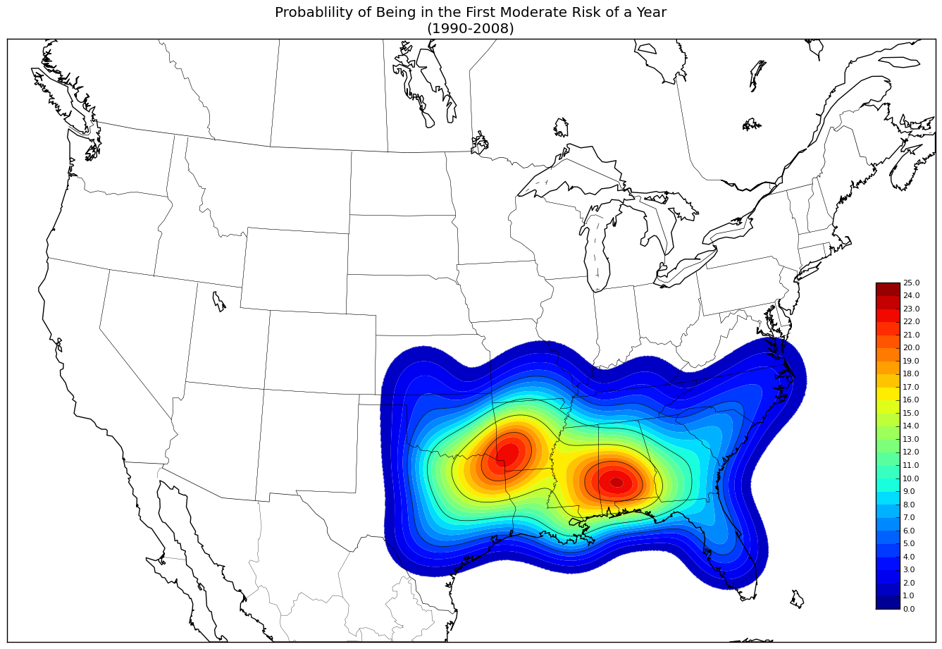
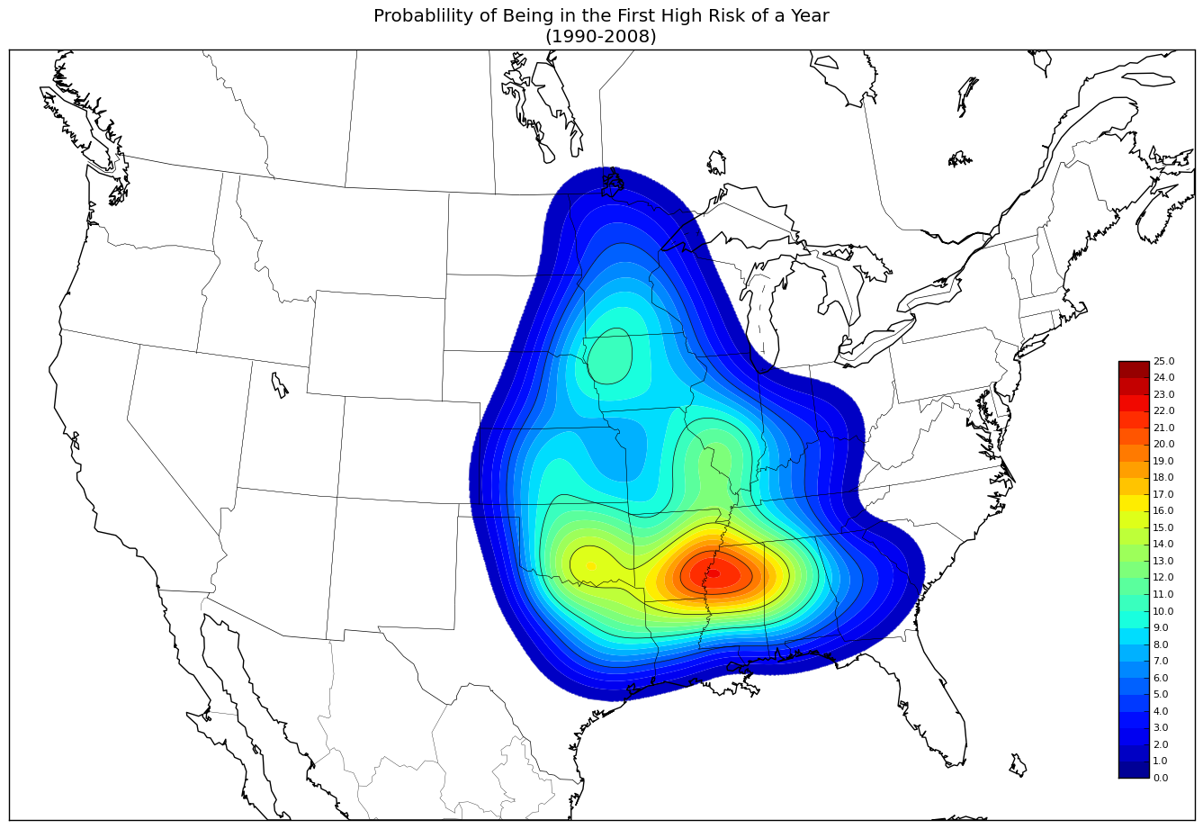
In the graphics below, the colored contour intervals are every 1% and the thin black contours are every 5%.
- Climatologically, where is the most likely location to experience the first SPC Moderate Risk of a given year? There are actually two areas when using the raw probabilities: southwest Arkansas and southern Alabama. However, when applying the kernel density estimator, the area in southern Alabama has a slightly higher probability. As for when this first Moderate risk is issued, the average first issuance is 28 January.
- What about High Risk? There is actually more variability (both spatially and temporally) in the issuance of the first High risk than the first Moderate risk. This is most likely the result of the greater variability in time of year, and thus greater variability of the large scale pattern. High risks have been issued as early as 21 January (1999) and as late as 1 July (1997). [Technically it has been issued as late as never, because 2000 did not have a single High risk issued.] For early High risks, the favored location is in the southeast United States where the ingredients that favor severe thunderstorms is more often confined to the Gulf Coast areas. Later in the year, more northern locations are favored as the cyclone track, and ingredients for severe thunderstorms, lifts northward. With this said, the first High Risk is typically issued across portions of southeast Arkansas and northern Mississippi between 27-28 March.
First Moderate Risk of Year (1990 – 2008)
1990: Jan 18 (1200 UTC)
1991: Feb 18 (1200 UTC)
1992: Jan 13 (1200 UTC)
1993: Jan 15 (1500 UTC)
1994: Jan 26 (1200 UTC)
1995: Jan 06 (2000 UTC)
1996: Jan 17 (2000 UTC)
1997: Jan 24 (1500 UTC)
1998: Jan 15 (1500 UTC)
1999: Jan 22 (1200 UTC)
2000: Jan 03 (1200 UTC)
2001: Feb 08 (1630 UTC)
2002: Jan 23 (1630 UTC)
2003: Feb 21 (1200 UTC)
2004: Mar 04 (1200 UTC)
2005: Mar 21 (1200 UTC)
2006: Jan 02 (1200 UTC)
2007: Feb 23 (1200 UTC)
2008: Jan 10 (1630 UTC)
First High Risk of Year (1990 – 2008)
1990: Feb 01 (1200 UTC)
1991: Mar 22 (1200 UTC)
1992: Apr 19 (1200 UTC)
1993: Apr 19 (1500 UTC)
1994: Apr 25 (1200 UTC)
1995: Apr 17 (2000 UTC)
1996: Mar 18 (1200 UTC)
1997: Jul 01 (1500 UTC)
1998: Apr 08 (1200 UTC)
1999: Jan 21 (1200 UTC)
2000: [ None ]
2001: Apr 06 (1200 UTC)
2002: Apr 16 (1200 UTC)
2003: Apr 06 (1630 UTC)
2004: Mar 04 (1630 UTC)
2005: Apr 11 (1630 UTC)
2006: Mar 12 (1200 UTC)
2007: Mar 01 (1200 UTC)
2008: Feb 05 (1300 UTC)
*There were no High risks issued in 2000, thus only 18 years of data were used to calculate averages regarding High risks. Therefore the resulting graphics and statistics should be considered conditional statistics, meaning these statistics assume a High risk will be issued during a given year.
