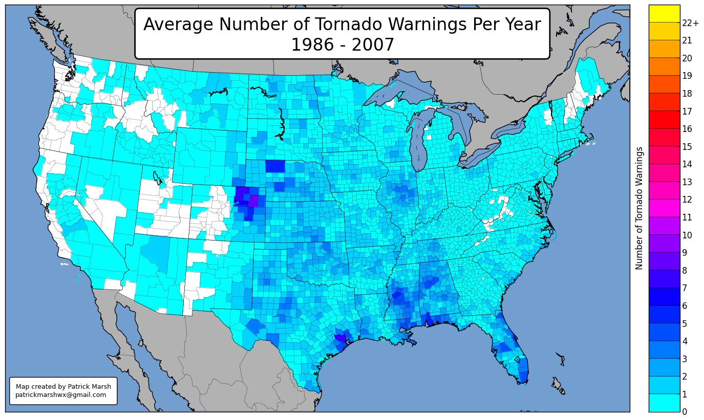
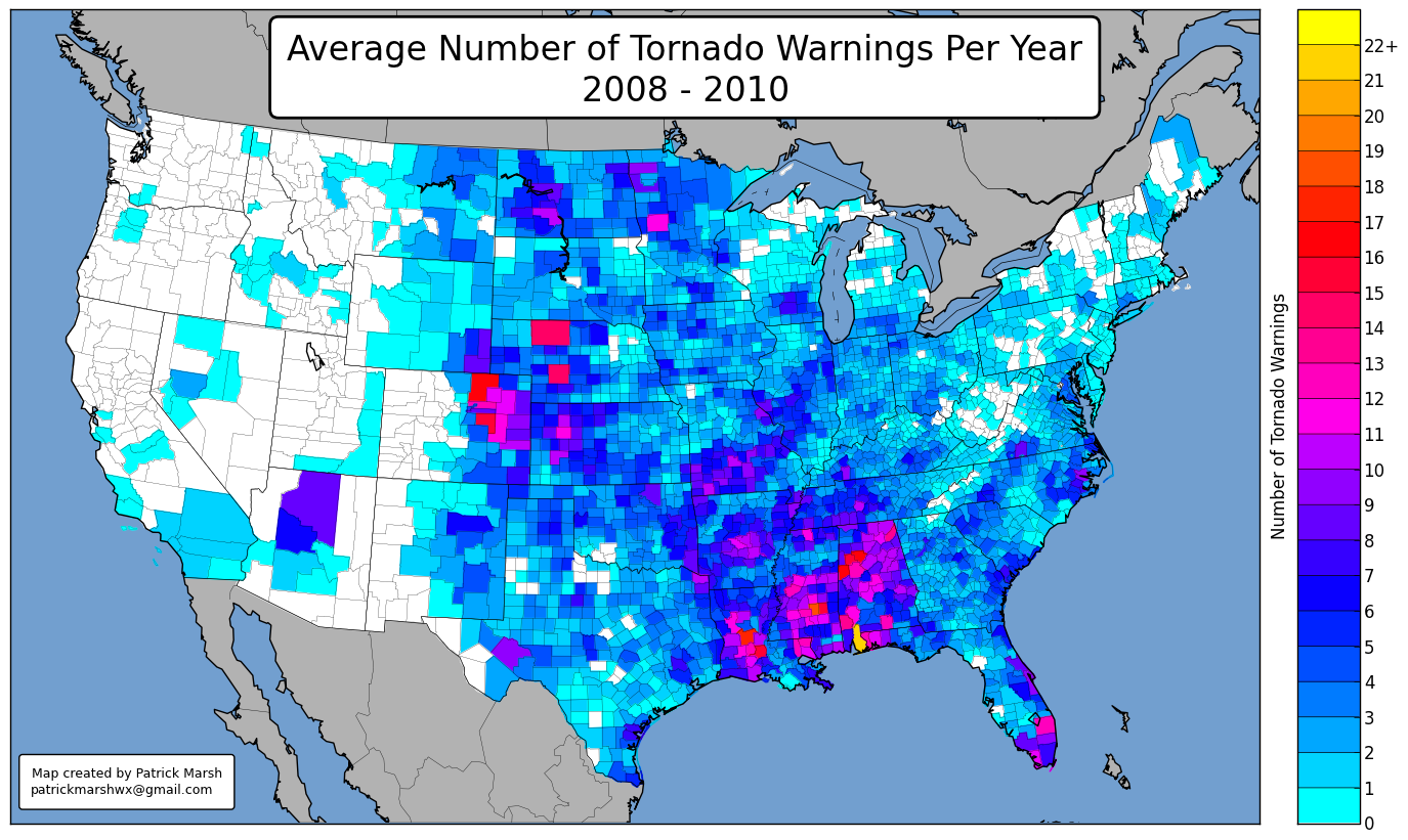
Today kicked off the first day of the Weather Ready Nation: A Vital Conversation. (OU is recording and posting the presentations on the web.) Dr. Harold Brooks of the National Severe Storms Laboratory really got things going with a presentation on our known challenges. One of his main take-away points was that the number of tornado warnings issued has dramatically increased in the recent era. To illustrate this point, I provided two county-level heat maps (below). The top figure is the average number of tornado warnings per county per year from 1986-2007. The bottom figure is the same figure except for 2008-2010. As you can see, the average number of tornado warnings per county per year has increased almost uniformly across the county, although the increase is much larger in some areas and almost non-existent in others. Whether or not this is an improvement in National Weather Service “service” is one of the topics open for discussion in the following days.
I’m sure I’ll create more figures in the coming days.

