I’ve now uploaded the animations of estimates climatological probabilities of F/EF-1 or greater tornadoes, Hail 1″ or greater, and significant severe weather. The probabilities are estimated from the 30 year period of 1982-2011. Probability animations exist for tornadoes, hail, wind, and any severe. For more information check out the original post or the post on the “non-significant” severe! The raw images should become available on the Storm Prediction Center’s website in the coming weeks.
Because the image quality is a bit degraded in the animations, the color scales for each animation are listed below.
I’ve cleaned up and finally uploaded the animations of estimates climatological probabilities of severe weather. The probabilities are estimated from the 30 year period of 1982-2011. Probability animations exist for tornadoes, hail, wind, and any severe. For more information check out the original post! The raw images should become available on the Storm Prediction Center’s website in the coming weeks.
Because the image quality is a bit degraded in the animations, the color scales for each animation are listed below.
The past few months I’ve called my blog “Fighting Hyperbole with Data”. This was a nod toward the reputation I cultivated of “poking the bear with a stick”. Admittedly, that reputation was a bit of hyperbole in and of itself, an irony that was not lost on me. I went ahead and left the title as it was because I liked the idea of being someone who remained above the hype and focused solely on the data. I didn’t always adhere to these principles, but when I veered off track, or made a mistake, I always tried to be open, honest, and admit/correct the mistake. That’s the way blogs work; they are built on trust between the author and the reader. Readers implicitly trust authors that what they are reading is factual; authors trust that readers will appreciate their work, share the information with friends when something is of interest, and refrain from passing off the work as someone else’s.
To this end, I’ve decided to rename the blog to simply “Playing with Data“. It’s a better description of what I do and, more importantly, what I want this blog to be. I like data. I play with data. I enjoy data. Data are everywhere and offer insights into a world of chaos. All it takes is time to learn the tools necessary to peel back the layers of obfuscation. Our world is full of information just waiting to be discovered or put into context. This is my underlying motivation for becoming a scientist. A fundamental curiosity of what I don’t know or don’t understand.
Readers may have noticed that some of my more recent work (figures) have my name and a link to the website embedded in them. This is in response to a alarming increase in the number of instances of seeing my work used without permission and without attribution. I’ve wrestled with this a lot of late. I don’t mind people sharing my work as long as I get credit for the work I put into it. sharing interesting and sometimes exciting discoveries with all who care to learn and protecting my work. I try to be protective of my work because I put a lot of effort into it. I typically work 60-80 hours a week on “science”. To date, nothing to my knowledge posted on this blog is what I’m paid to do as a graduate research assistance. This means none of this work helps me get closer to graduating and that all of it is done “on the side”. Yes, I do love it, but at the same time I am working to develop my skill set in hopes maximizing my chances of future employment. I’m still a student. A student who is graduating in the next 6 months. A student who is on the job market. I post things to this blog in an effort to share information, but also to highlight my work in hopes of attracting interest from those in positions to offer me jobs (consulting or full-time). I naively thought that “branding” my work wasn’t necessary, and even presumptuous. Apparently, I’m not very good at marketing.
Admittedly, this has impacted my posting frequency of late. I’m much more hesitant to post things here that may be of benefit to me down the road. As a strong advocate of the open-source model this hesitance to share work results in an internal struggle to balance sharing and protecting. I don’t suspect this struggle won’t go away any time soon, but I want to reaffirm my commitment to keeping the trust of those who read this blog. I know I don’t always perfectly adhere to my ideals; I’m learning to respond professionally when others don’t. I’ve got a ways to go, but hopefully you’ll stick around as I continue to grow as a scientist. I’m sure we’ll learn some really cool things along the way.
This afternoon a thunderstorm over southern Mississippi underwent an evolution that is often associated with tornado occurrence in thunderstorms. Whether or not a tornado developed remains to be seen, but the radar evolution was fairly classic. What do I mean?
Consider the image above. The left panels are from the radar’s lowest tilt and the panels on the right are from a mid-level tilt. The top panels are radar reflectivity (which is what you typically see on television) and the bottom panels are of the doppler velocity (i.e., the wind speed and direction in a radial sense [towards or away from the radar]). [For orientation purposes, the radar site is located in the bottom left of the image, green values (in the velocity panels) are toward the radar, and red values (in the velocity panels) are away from the radar.] The mid-level pattern is similar to what one might conceptually think about with respect to identifying possible tornadoes on radar, meaning that a rotation signature is present. However, examining the lower-level tilts, we fail to find a rotational signature. Does this mean there is no tornado? Well, not-exactly…
Before continuing, let’s remind ourselves that a tornado is an extension of a thunderstorm’s updraft. By definition, an updraft is a area where air is ascending. Furthermore, the mass continuity equation dictates that if air is rising, there must be convergence at the base of the updraft. This means that in the presence of a developing tornado, you may not find a rotational couplet; instead you might find a convergent signature, which is exactly what we see in the radar image above.
In the next radar scan (shown below), as the (possible) tornado continues to develop (and move farther away from the radar site), we notice that the broad, low-level convergence still persists. However, in this scan, one can notice the addition of a rotational couplet in the midst of the broad low-level convergence. If one were to continue to follow the evolution of this (possible) tornado, one would find that the low-level rotation signature persists for several more volume scans…all in the vicinity of the broader, low-level convergence.
So, what does this mean? When looking at radar data, it is important to examine the entire radar volume — not just the lowest tilts! Thunderstorms are very complex. What happens at low-levels typically plays a role in what happens in the upper-levels, and what happens in the upper-levels impacts what happens in the lower-levels.
Anyways, I’m pretty sure you aren’t here to read about why I haven’t posted.
For reasons too numerous to list here, I have been interested in understanding risks associated with high-impact weather. One particular interest of late is the debate between weather enthusiasts regarding the risk posed by tornadoes in the plains to the risk posed by tornadoes in the southeast United States. Typical arguments of risk revolve around who has the greatest number of tornadoes, which would seem relatively unambiguous. However, because of the relative rarity of tornadoes, even this is rife with controversy. Additionally, people tend to associate tornado risk/exposure based upon the ill-defined “tornado season” of the even more nebulous “Tornado Alley”.
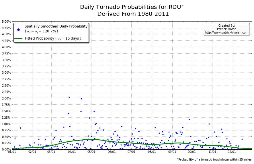
Previously, Dr. Harold Brooks of the National Severe Storms Laboratory, put together time series of the annual cycles of tornado, wind, and hail probability. These time series were constructed using data from 1980-1999 and provided insight into the yearly cycle of severe convective hazards at individual locations. This allowed for assessing the risk/exposure to various convective hazards based on the actual climatology of a given area, rather than relying on the gross statistics of “Tornado Alley”. Unfortunately, Dr. Brooks’ data had not been updated to account for the additional decade of tornado data and thus was removed from the NSSL website. Updating this information has long been on my wish list; this week I decided to cross it off my wish list.
(Note: Dr. Brooks has since informed me that the data were removed, not because they had not been updated, but because the software broke.)
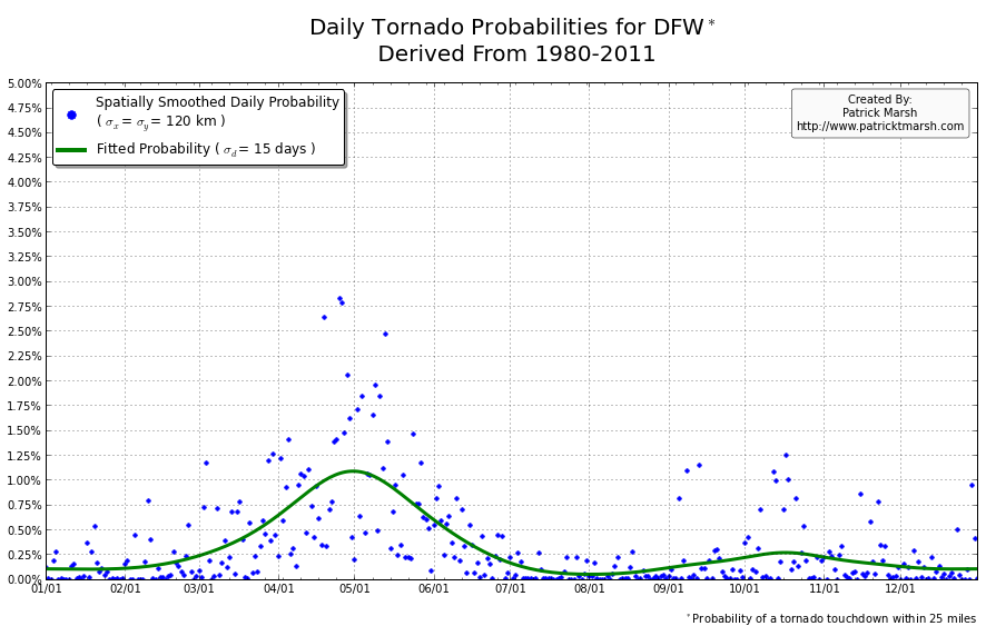
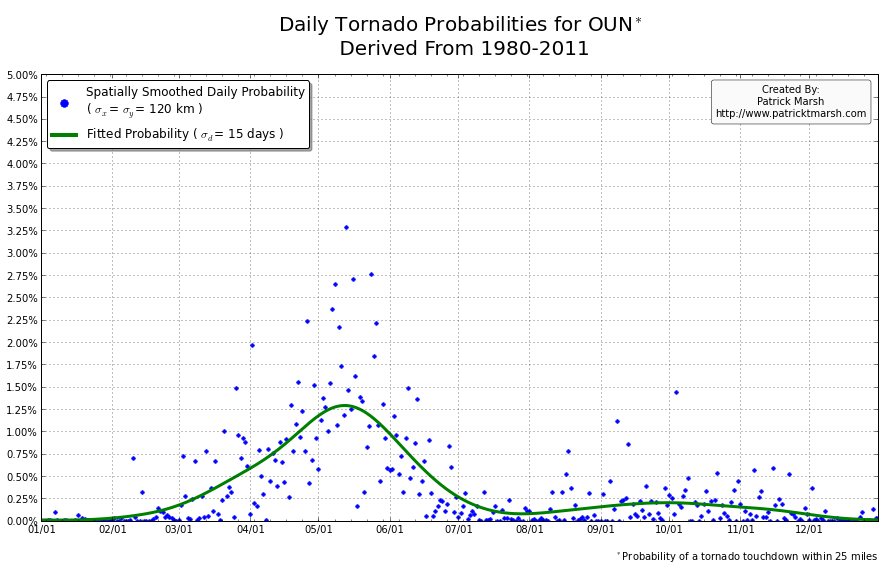
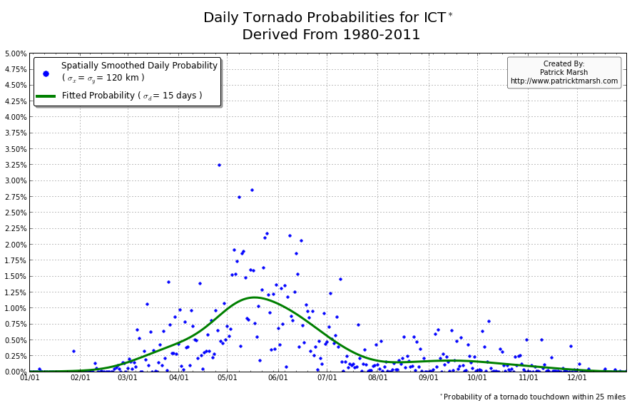
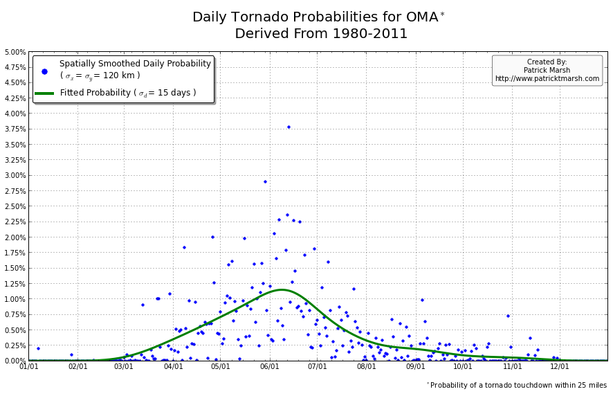
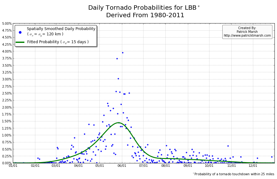
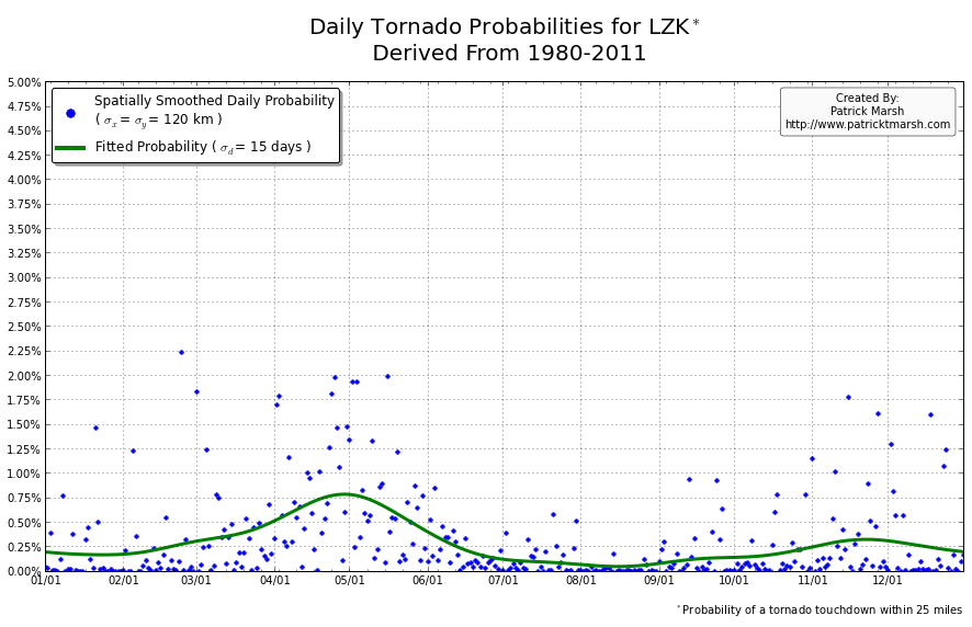
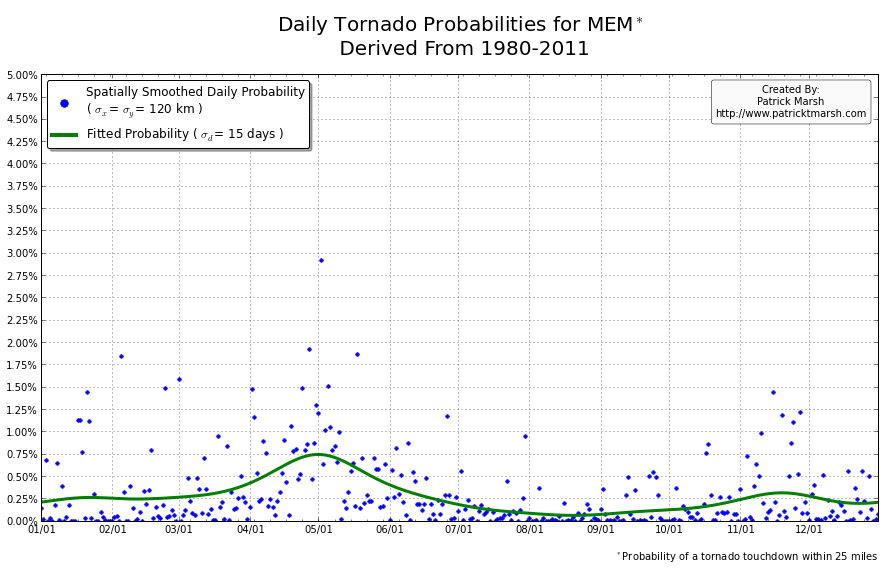
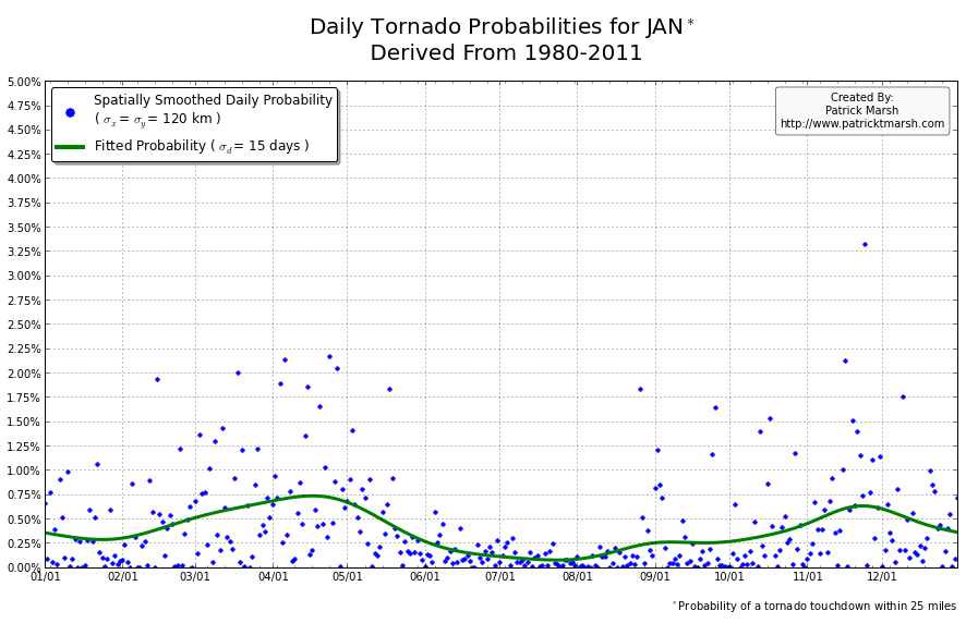
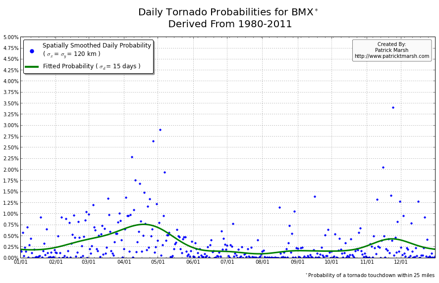
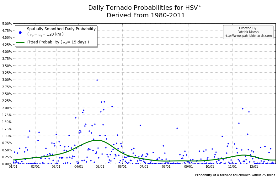
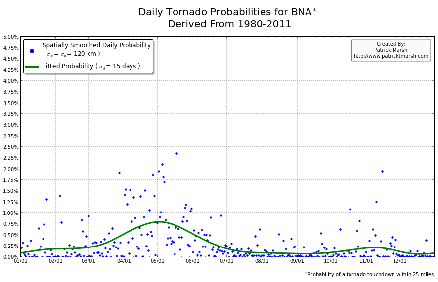
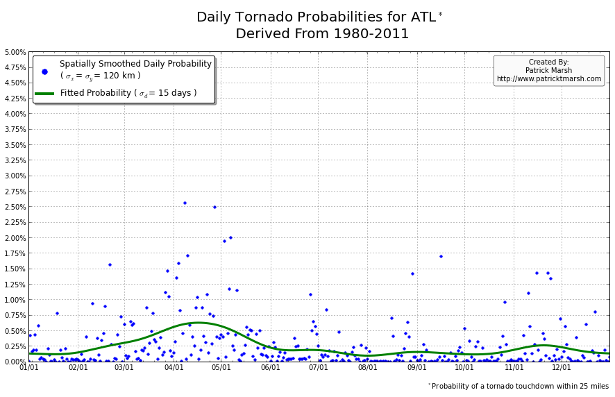
The annual cycle of at least one tornado occurring the United States shows a pronounced peak in the summer months. It is my guess that “tornado season” refers to this significant uptick in US tornado probabilities, meaning we can define “tornado season” as the time period of relatively enhanced tornado probabilities. I suspect that a vast majority of people throughout the United States assume that their individual risk follows a somewhat similar distribution, albeit with smaller probabilities. Unfortunately, this is not the case. Here are the annual cycles of the probability of a tornado developing within 25 miles of a point for a smattering of locations throughout the United States that all have roughly the same overall tornado exposure:
As you can see, not every location has a single peak probability in the late spring into early summer. So called “tornado season” varies from location to location, even though the yearly risk/exposure (area under the green curve) are similar. The annual cycles are sorted into two groups to illustrate that the annual cycles for locations in the plains are different from those in the southeast. In the plains, the annual cycles have one predominant peak probability (which roughly corresponds with the US peak probability), indicating a well-defined “tornado season”. In the southeast there are multiple peaks — albeit each one smaller than those seen in the plains — but the off-peak probabilities are typically greater than the off-peak probabilities in the plains.
So what does this all mean? One’s climatological exposure to tornadoes is geographically-dependent. Another way to say this: “Tornado season” in the southeast US is fundamentally different than “tornado season” in the plains. Persons located in the plains have a greater risk of a tornado developing within 25 miles of their location in the spring than they do any other time of the year. Persons located in the southeast have a relative small increase in probability in the spring/summer, but must be on guard all year as the climatological probability of a tornado never really approaches 0.
Update 2: Here is a video of the daily probabilities for the entire US. Please note that the standard resolution video is a bit degraded. For more clarity, please switch to the HD version.


