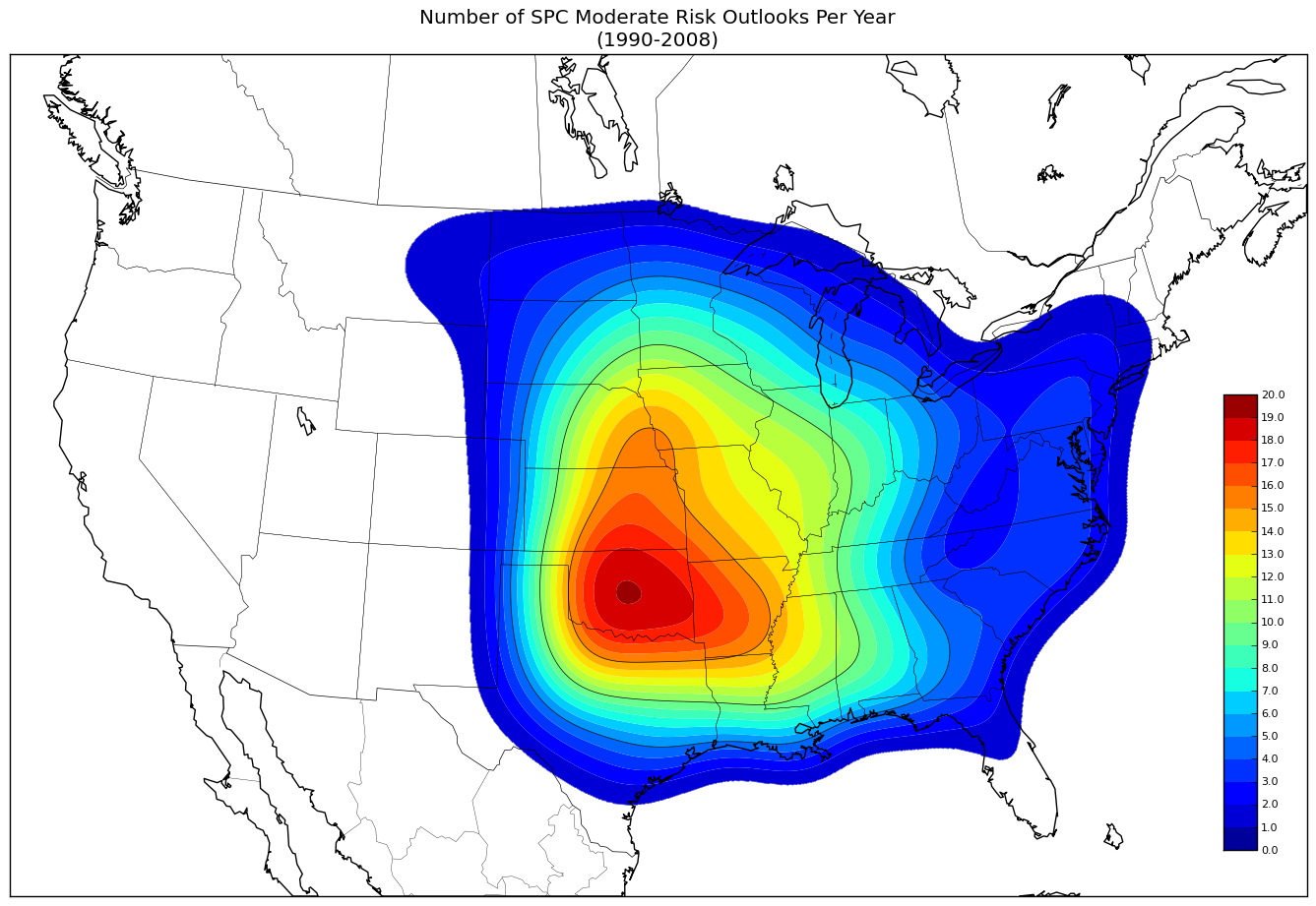
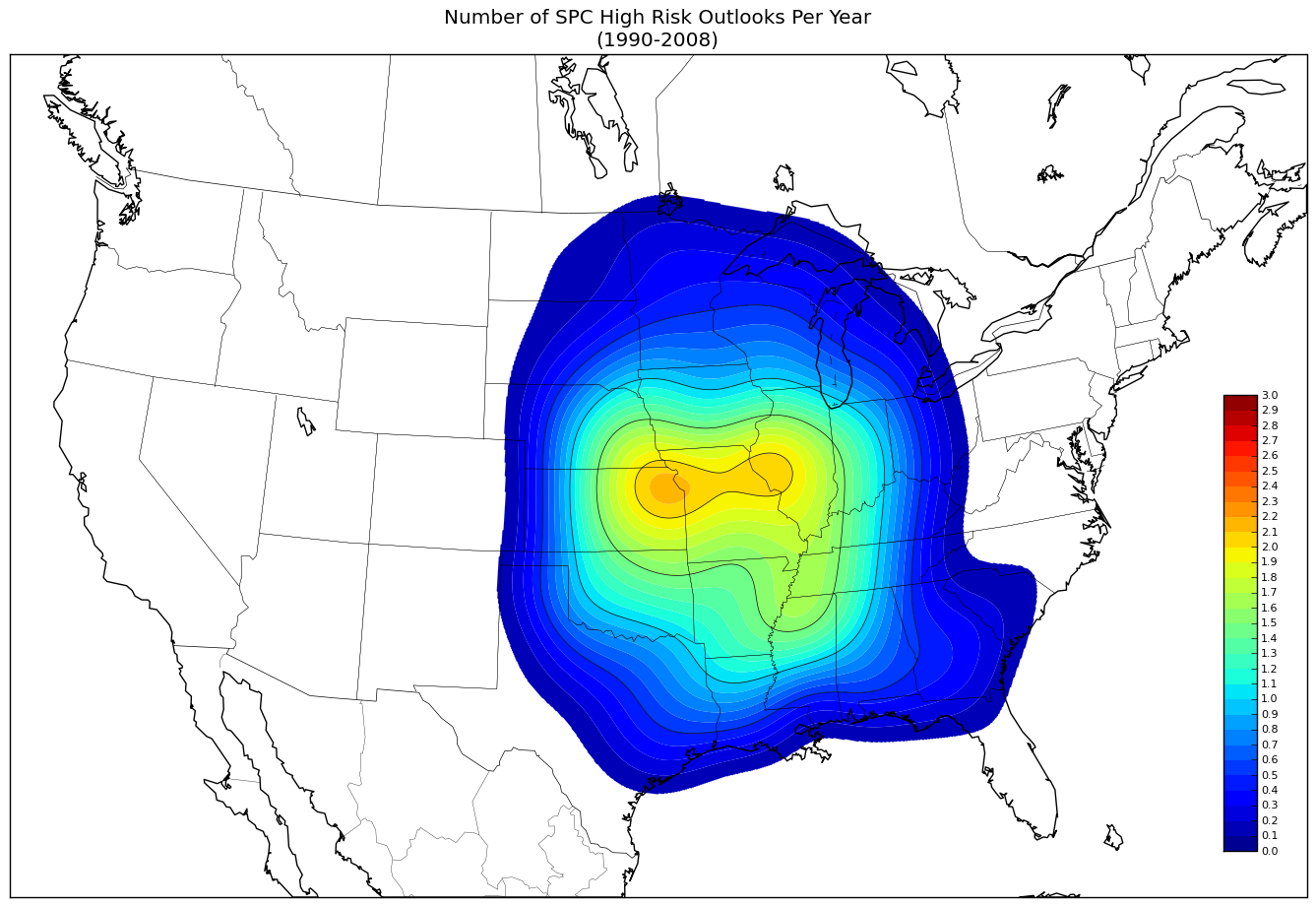
After posting the climatology of where the first moderate and high risks occur, I’ve received a couple of requests for additional graphics. One that was extremely easy to produce, and also one most frequently requested, is a climatology of moderate and high risks. Using the same Kernel Density Estimation technique described in the original post, I’ve calculated the number of moderate and high risk outlooks an area might expect during a given year, based on data from 1990 through 2008.
Edit to add: Between 1990 and 2008 there were 3454 moderate risks and 243 high risks issued.
Please note that each day consists of multiple outlooks and so it is possible for a grid point to receive multiple “hits” for being located in a Moderate or High risk outlook on the same day. In other words, if your location is located within 2 high risk outlooks, this does not guarantee that you will have two days of high risks. The location might simply be contained within a high risk from two separate outlooks issued for the same day.
For moderate risks, central Oklahoma appears to be the clear winner with nearly 30 moderate risks averaged per year. Increase probabilities extend both north and east from here.
As expected, the average number of high risks per years is considerably less than the average number of moderate risks. (In fact, I had to change the color scale!) Northeast Kansas, northern Missouri, and west-central Illinois are the most likely areas to experience a high risk in a given year with slightly more than 2 expected. A minor axis of increased probability extends southward from the eastern edges of this highest probability band, reaching portions of eastern Arkansas and far northern Mississippi.
Notice how in both of these climatologies, the maximum probabilities are centered in the central United States — east of the Rocky Mountains and west of the Appalachian Mountains. We’ll leave discussion as to why this is for another blog post.
