Playing with Data

Personal Views Expressed in Data

Tornado Emergencies: Stirring the Pot

Note: The presentation has been updated to correct the terminology. What was previously identified as Probability of Detection (PoD) was actually Success Ratio (1-FAR)

Note 2: This work should still be considered preliminary. The severe weather report database is riddled with problems as is commented on by numerous papers in scientific literature. Results may change as better data, such as county level tornado data, become available. However, I stand by the fact that Tornado Emergencies should be so good that even preliminary results capture their usefulness.

Here is a link to download my presentation on Tornado Emergencies from today’s National Severe Weather Workshop. I firmly believe the NWS is standing on a precipice, and the entire meteorological community needs to take a moment and figure things out before it’s too late. This presentation is designed to start a conversation; let the discussion begin!

A Review of NWS Tornado Emergencies

Seasonal Outlooks: How Quickly We Soon Forget…

This morning as I was making my rounds on social media before my day began, I came across a tweet from a good friend, and even better meteorologist, Ryan Vaughan. Apparently overnight some hail producing thunderstorms had rolled through his area after his forecast mentioned that the trough responsible for the thunderstorms would remain south of the area. Unfortunately, his forecast was off by about 100 miles, which is really good when you consider he’s attempting to forecast something that is “invisible”. But as someone who takes pride in his work, he was a tad disappointed. Ryan’s tweet simply stated,

“God sure has sent me a couple of slices of humble pie lately when it comes to forecasting. As I’ve said, sometimes we forecast, he laughs.”

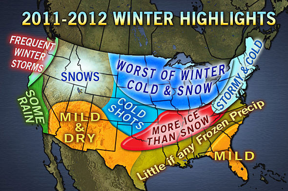
After seeing this tweet, and thinking about how humbling forecasting can be, I came across a thread on a message board that was discussing the recently released AccuWeather Seasonal Tornado Forecast. In the thread it was brought up just how bad AccuWeather’s 2011 – 2012 Seasonal Winter Weather forecast had been (image below).

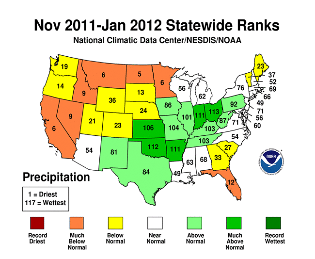
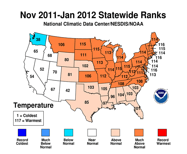
This forecast was particularly atrocious when you consider the November 2011 – January 2012 average temperature and precipitation maps shown below. As you can see, the area on the AccuWeather forecast that was to experience cold and snow conditions has actually observed temperatures that are well above normal and precipitation amounts largely below what is expected. In fact, places such as Midland, TX have received just as much, or more, snow than places across the midwest. Northeast Arkansas had received more snow by November (~10 inches in places) than Chicago, IL and Buffalo, NY had received by mid-January.

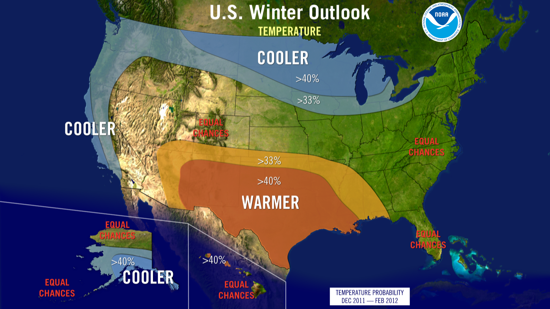
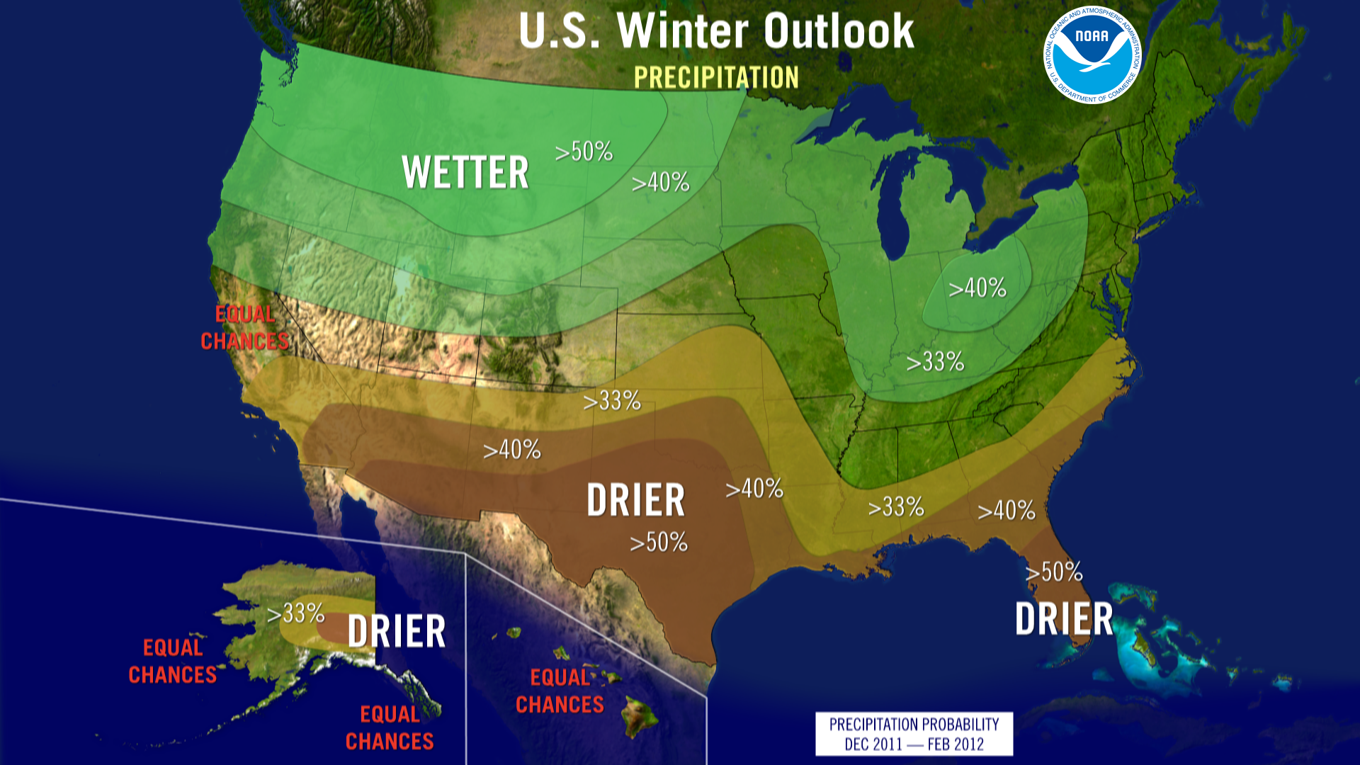
But this discussion isn’t about AccuWeather per se. To prove my point, here are the forecasts from the NOAA/NWS Climate Prediction Center. They are slightly better than AccuWeather on the temperatures across the south, but still call for cooler weather (than normal) across the north. The precipitation forecasts are almost 180 degrees out of phase from what happened in reality.

Don’t get me wrong; seasonal forecasting is hard. There is a reason why the severe convective hazards research community has resisted making seasonal tornado outlooks for so long — there is just too much intra-seasonal variability! But what really bothers me is when people use a forecasting philosophy of persistance on the seasonal scale. The idea behind persistance is that the atmosphere is in a relatively stable state and what’s previously happened will continue to “persist”.

In the southern plains, the first half of February 2011 was a winter nightmare. Two major winter storms traversed the area in the span of two weeks, with a comparatively “minor” winter weather event in between. (Note, that this “minor” winter weather event would have been considered a fairly significant one during a “normal” winter — whatever that is!) In addition to heavy snow, these winter storms were also accompanied by bitter cold. In fact, during this approximately two week span, Oklahoma set it’s all-time record low temperature and Arkansas reported it’s greatest 24-hour snowfall accumulation in history.

What people failed to remember was that this occurred in the midst of an extremely warm and dry winter. As cold as it was in Oklahoma during the first half of February 2011, the second half was even warmer than the first half was cold! Remember the record low set? Less than a week later the temperature had warmed over 100 degrees Fahrenheit at the same location! In fact, Oklahoma finished the month either near “normal” or slightly above normal in terms of average temperature.

During the winter of 2011-2012 2010-2011, Earth was experiencing a La Nina pattern. Namely, the waters of the central Pacific were cooler than normal. This has profound impacts downstream (i.e., over the United States). Typically during a La Nina, the CONUS is drier and milder than average, but due to atmospheric processes I won’t discuss here, is subject to extreme cold outbreaks. If one of these extreme cold outbreaks encounters moisture, then the recipe for a winter storms is well on it’s way to completion — as was the case in early February 2011.

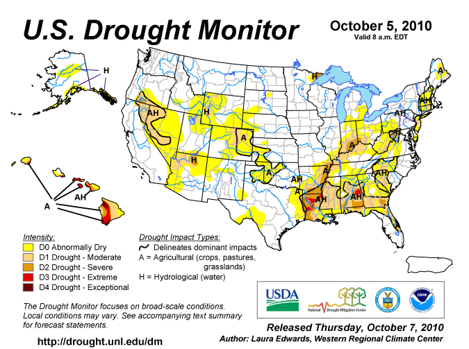
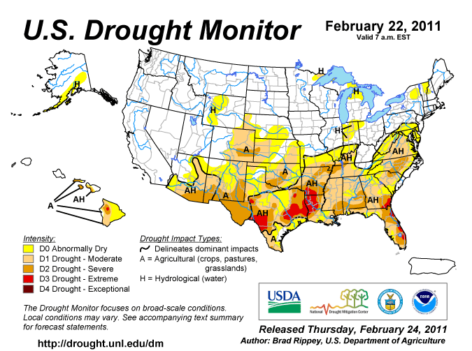
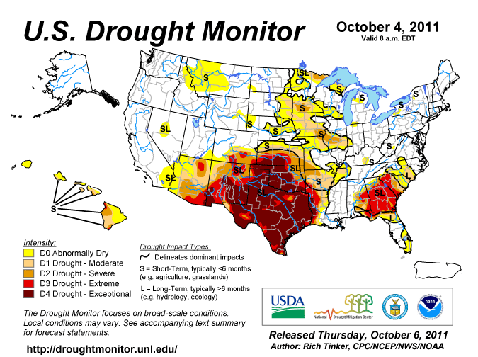
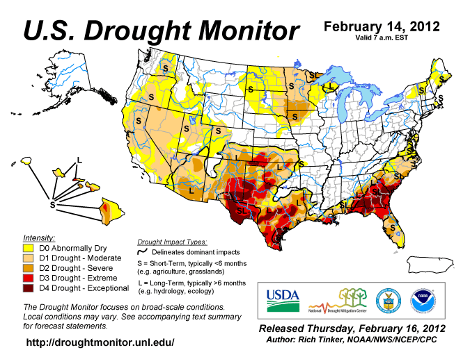
To illustrate just how dry the winter of 2010-2011 2011-2012 was for the southern United States, below are a series of images from the U.S. Drought Monitor. It shows that in October 2010 (before the 2010-2011 winter) that much of the southern plains was experiencing normal to slight drought conditions. Fast forward 4 months and that picture had changed (Second image: February 2011 — after the barrage of winter storms). Pretty much everywhere in the southern plains was experiencing a drought. A drought that would persist through the Summer, culminating in the worst category of drought by October 2011 (Third Image).

When seasonal forecasts called for a repeat performance of La Nina this winter (not that La Nina’s are “repeatable”), a lot of those in the weather business called for a repeat of last winter’s conditions, which to a 0th order is reasonable expectation. So imagine my surprise when people tended to remember and focus on the two week period of extreme cold and heavy snow, rather than the season-long drought and mild conditions. I nearly fell out of my chair when I heard a local television meteorologists talk about how since we had X last winter and we got a lot of cold and snow, and X is expected this winter it should be a cold and snowy winter. How quickly we tend to forget! Out perceptions of what happened is affected more by extreme, unusual, and disrupting events, rather than the long-term mundane average. So, how did the forecast for a cold, snowy winter pan out? Well as you can see above, it’s been wetter and warmer than normal. It’s been so wet in fact, we’ve made substantial progress in overcoming a large part of our drought (below). Although, we still have a long ways to go.

So, what’t the take away point? Seasonal forecasting is hard. At its current optimum, it is slightly better than an educated guess (although, some might argue that all forecasting is this way!). So, when you hear the prognosticators try to spin their poor seasonal forecasts, you should know better than to fall for it. And when they offer you their next “highly accurate” and “highly detailed” seasonal forecasts, you’ll know exactly what to do with it. Take it with a grain of salt.

SHARPpy Preview (AMS Presentation)

I should point out that SHARPpy does more than generate images. It is a functioning software package, including dynamic readout. Although SHARPpy requires users to input commands via the command-line at the moment, menus will be added in the coming weeks.

Last July I wrote about software I was developing for displaying forecast soundings. Unfortunately, after discussing what I already had done in preparation for last year’s Hazardous Weather Testbed (HWT) Experimental Forecast Program (EFP), my schedule prevented me from devoting any time toward this project.

In the days before Christmas I realized that I needed to revisit SHARPpy (SkewT and Hodograph Analysis and Research Program in Python) if I was going to have anything for my presentation at the American Meteorological Society’s Annual Meeting in New Orleans, LA. So, the last two weeks has been devoted to frantic code writing to put together some form of SHARPpy in time for my presentation. When I sat down and looked at my old work, I couldn’t understand, nor could I remember, what I had been doing. I decided to throw out my old work and begin anew.

SHARPpy has been completely overhauled. The visual aesthetics are modeled after the Storm Prediction Center’s sounding analysis tool, NSHARP, and the underlying numerical routines are based on SHARP95. SHARPpy is written completely in pure Python — no Numpy, Scipy, or Matplotlib. In other words, once Python is installed on a computer, you can install and run SHARPpy — there are absolutely no additional dependencies to install! The motivation for sticking with pure Python, and sacrificing the speed Numpy, Scipy, and Matplotlib offer, was to allow for simple integration into the National Weather Service’s data visualization software package (Advanced Weather Information Processing System II — AWIPSII), which is currently under development. (Note, SHARPpy 2.0 will most likely be refactored to make use of Numpy, Scipy, and Matplotlib.)

SHARPpy is written in such a manner that the file handing and data management, graphical displays, and numerics are all separate. This greatly increases SHARPpy’s utility. Inside SHARPpy, all calculations are done on a custom data structure, called a Profile Object. The Profile Object consists of 6 data arrays: Pressure, Height, Temperature, Dewpoint, U-component of wind, and V-component of the wind, as well as some meta-data and helper functions to identify things such as the index of the surface layer. (Alternatively, one could provide the Wind Direction in degrees and Wind Speed and the Profile Object will convert these to the U-, V-components on the fly.) The benefit of using the Profile Object is that SHARPpy knows the structure of the data on which it will operate and/or draw. Thus, in order to add support for additional data types (observational, BUFKIT format, raw models, etc) all one has to do is create a wrapper to put the data into the Profile Object. (The Profile Object has helper functions to create itself. All one does is pass the 6 arrays!) Also, since the drawing is separate from the numerics, SHARPpy can be used to compute thermodynamic and kinematic parameters for model output — without having to actually draw individual soundings!

Below are a smattering of sample images created this evening.

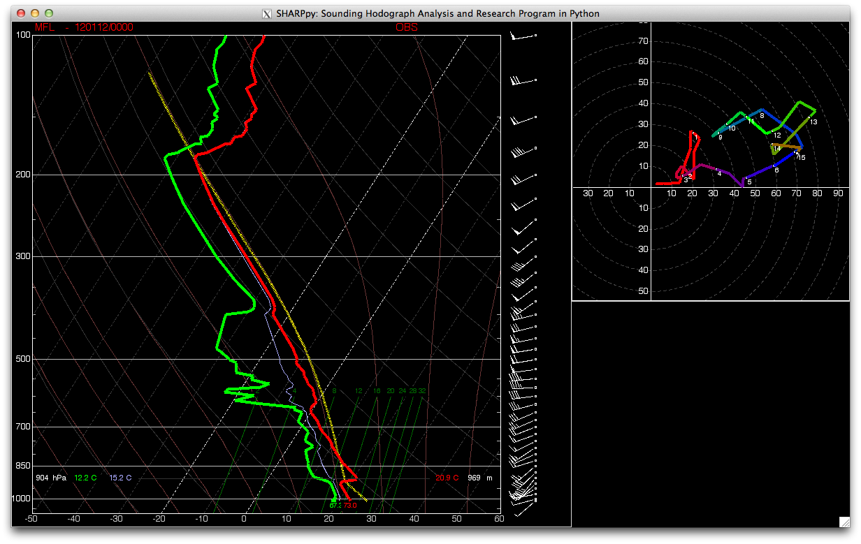
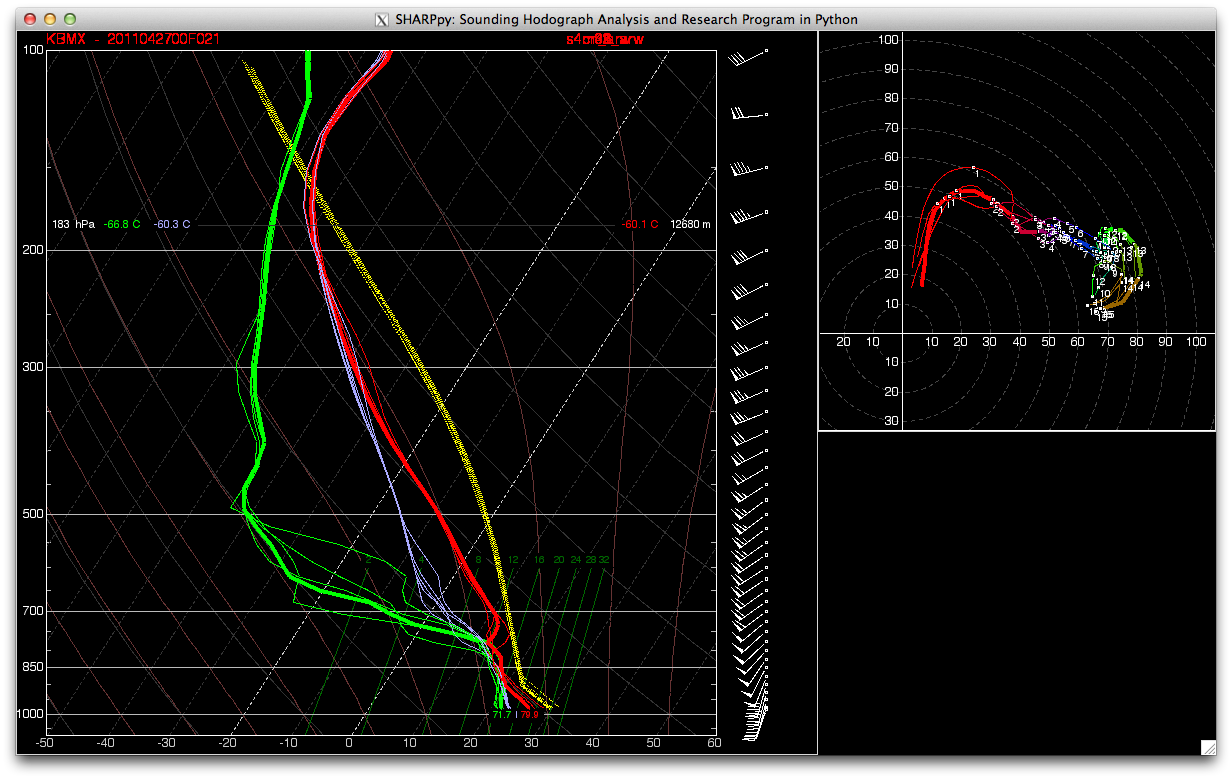
The first image is tonight’s sounding from Miami, FL. The temperature trace is in red, the dewpoint trace is in green. The blue trace corresponds to the wet-bulb temperature. The yellow-traces (there are more than one, they just overlap!) are the parcel trajectories for a Surface-Based Parcel, 100-hPa Mixed Layer Parcel, and the Effective-Inflow-Layer Mixed Parcel. In the upper-right, the hodograph is displayed with white dots indicating each 1km AGL interval. (Note, the program goes out to the web and downloads the data, lifts all the parcels, and draws the display in about 1-1.5 seconds!)
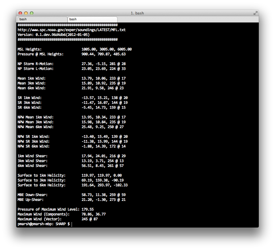
In addition to computing the visual SkewT and Hodograph, SHARPpy can compute kinematic variables and parameters. Below are just a sample of the fields that can be computed. Wind information is displayed in a format of U-, V-component, Wind Direction @ Wind Speed. Helicity information is provided positive+negative helicity, positive helicity, and negative-helicity. Again, this takes less than 0.5 seconds to compute and display. (These are for the Miami, FL sounding displayed above.)
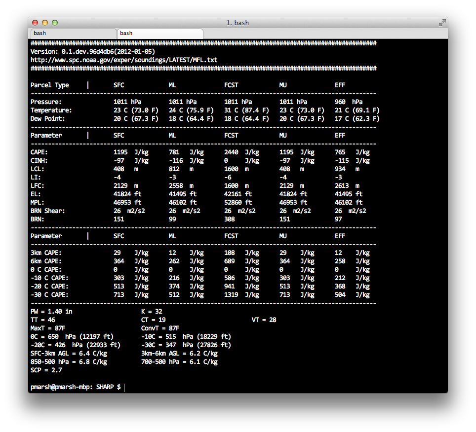
Below is a small sample of the thermodynamic variables and parameters that can be computed. All five parcels (Surface, Mixed-Layer, Most-Unstable, Forecast Surface, and Effective Inflow Layer) are computed. This routine takes about 0.5 seconds to run. (These are for the Miami, FL sounding displayed above.)
Lastly, I’ve incorporated preliminary support for ensemble soundings. Below are five, 4-km storm-scale ensemble member forecasts for Birmingham, Alabama. These model simulations were created in support of last year’s HWT EFP. They were initialized at 00 UTC 27 April 2011 and are valid for 21 UTC 27 April 2011. Each forecast member has over 1100 sounding locations, with 37 forecast soundings at each location. These data are stored in a text file that is approximately 150MB per member! SHARPpy can read these text files, parse out the correct soundings, compute all the parameters, and draw the sounding in less than 5 seconds!

What is displayed are the temperature, dewpoint, wet-bulb temperature, and hodograph for each of the 5 members. The thicker lines are from the “control member” and the other lines are from various perturbations. I should also point at that the wind barbs plotted on the right of the skewt are from the control member, as well.
I still have a lot of work left ahead of me (such as fixing up some of the displays and incorporating the text output on the main graphical display), but SHARPpy is coming along nicely. If you will be attending the AMS Annual Meeting later this month, please be sure to stop by my talk! It’s in the Python Symposium and will take place Tuesday morning at 11:15 AM. After my presentation, I hope to release SHARPpy to the open-source community. This will give people the ability to download and test SHARPpy while it is still under development, provide feedback, and even help develop new features! Some features that I’m interested in including are time-height cross-sections, more winter weather support, and whatever else might come to mind! It is my hope that SHARPpy can become a community supported sounding analysis package that the meteorological community can coalesce around!

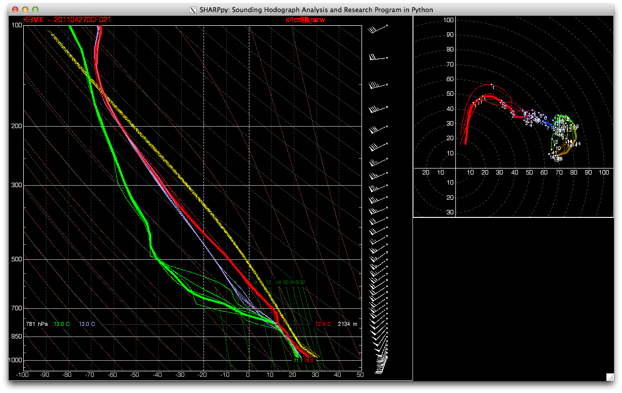
And, for my international friends, if you aren’t fond of SkewTs, SHARPpy can also make STUVEs!
Please let me know what you think!

A special thanks must go out to John Hart and Rich Thompson from the Storm Prediction Center. John provided the basic drawing classes and helped me understand how the drawing works. Rich helped me understand some of the internals and track down minor bugs! Without these two, SHARPpy would be a long ways off!
Caption This: Me at the Weather Ready Nation Conversation

Those who know me well know that I absolutely love to tease those with whom I am friends. To this end, below is a rather unflattering picture of me taken this week at the Weather Ready Workshop. I encourage everyone to take a moment and create a caption for this photograph. Please post your caption in the comments! (And, please, try and keep the captions somewhat clean!)

You can view more photographs from the Weather Ready Nation Conversation on the Flickr Stream.

Weather Ready Nation: Tornado Warning Frequency

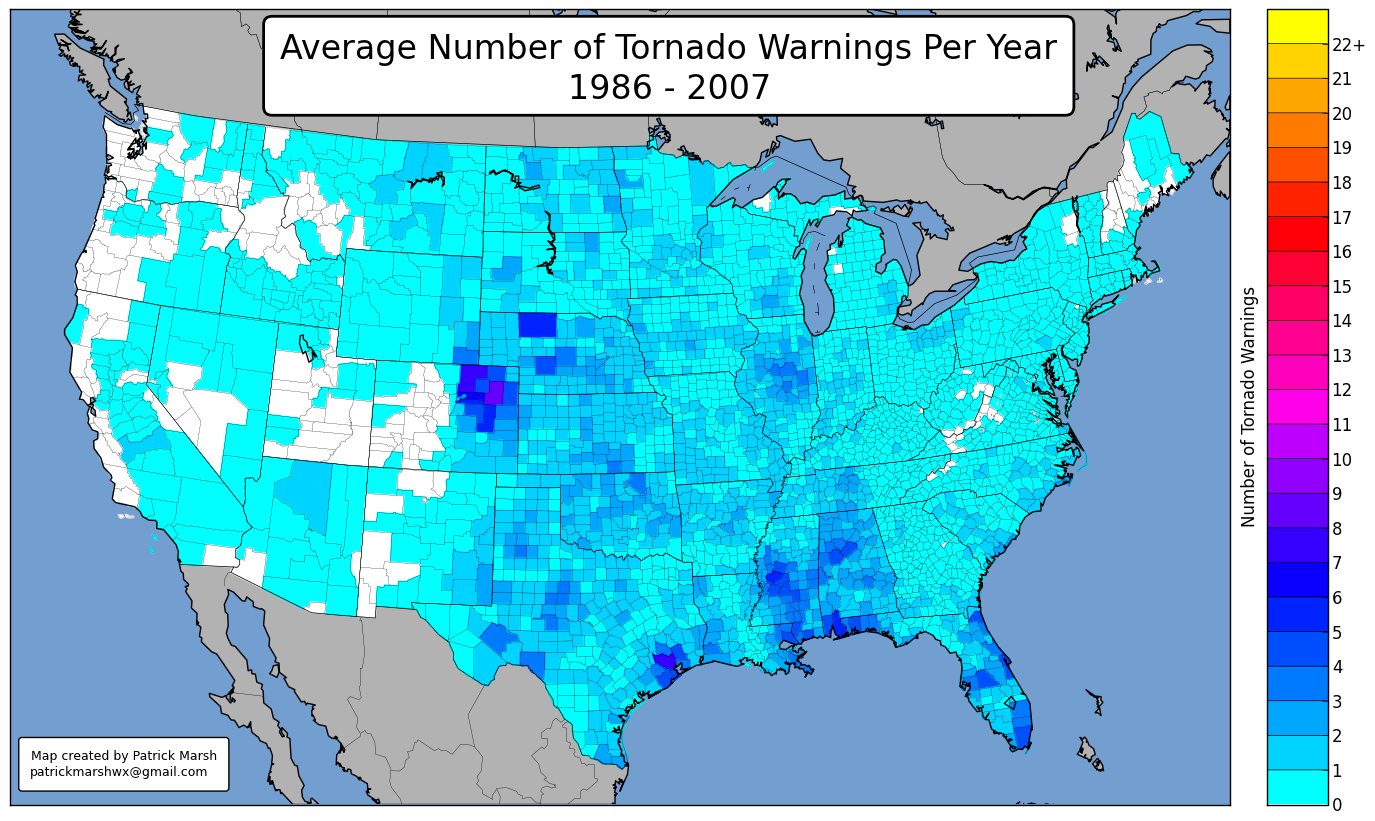
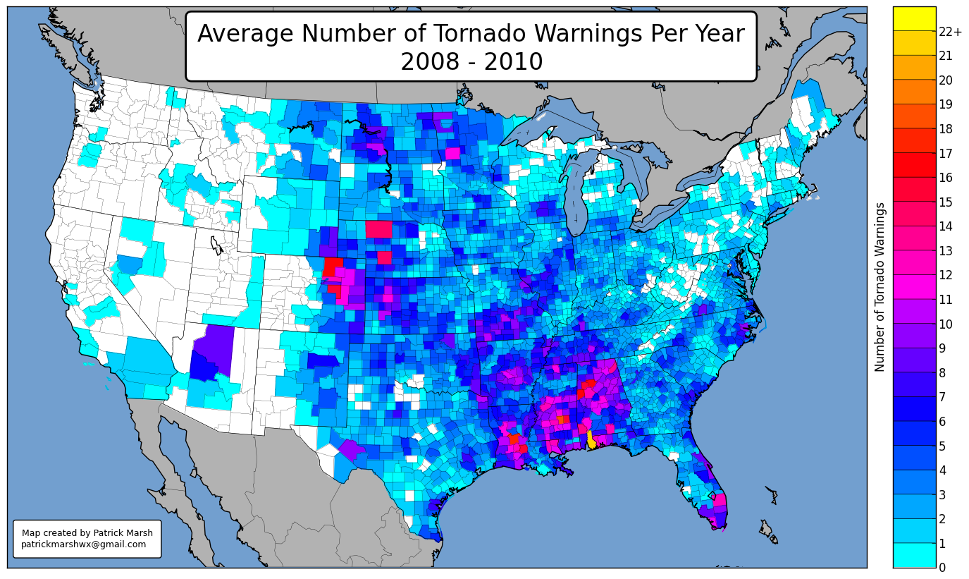
Today kicked off the first day of the Weather Ready Nation: A Vital Conversation. (OU is recording and posting the presentations on the web.) Dr. Harold Brooks of the National Severe Storms Laboratory really got things going with a presentation on our known challenges. One of his main take-away points was that the number of tornado warnings issued has dramatically increased in the recent era. To illustrate this point, I provided two county-level heat maps (below). The top figure is the average number of tornado warnings per county per year from 1986-2007. The bottom figure is the same figure except for 2008-2010. As you can see, the average number of tornado warnings per county per year has increased almost uniformly across the county, although the increase is much larger in some areas and almost non-existent in others. Whether or not this is an improvement in National Weather Service “service” is one of the topics open for discussion in the following days.

I’m sure I’ll create more figures in the coming days.