Playing with Data

Personal Views Expressed in Data

Meteorological Detective Work: Using All Your Tools

Tropical cyclones are giant, yet complex, heat engines driven by the release of latent heat. In a simplified context, here is how this heat engine works:

  • Thunderstorms develop over the warm tropical waters in an area of weak vertical wind shear. This results in thunderstorm updrafts being nearly 100% vertical.
  • As thunderstorms continue to develop, latent heat is released in the middle troposphere. As a result of this mid-tropospheric warming, updrafts become stronger.
  • Because air is rising faster than it is being replaced at the surface, the pressure at the surface decreases and a surface low-pressure develops.
  • As a consequence of the developing surface low-pressure, thunderstorms begin to congeal and rotate around a central point. Additionally, air at the surface begins to converge into the center of the low-pressure.
  • The increased surface convergence results in additional rising motion, meaning more thunderstorms, more latent heating, and further decrease in pressure.

Throughout all of this, the center of the tropical cyclone is located at the same horizontal location as a function of height. This is often referred to as a “vertically stacked cyclone”.

The processes described above continue until a balance is achieved, or something changes in the environment. Some negative environmental changes are cooler water temperatures (resulting in cooler, drier air being lifted), landfall, or an increase in shear. The reason an increase in shear is bad is because it tilts thunderstorm updrafts which acts to weaken the updrafts, in turn weakening the amount of latent heating.

The environment around Hurricane Irene has changed completely from a few days ago. Irene moved over land, is moving into cooler waters, and is experiencing an increase in vertical wind shear. How can I tell the latter? From utilizing the radial velocity from area Doppler radars.

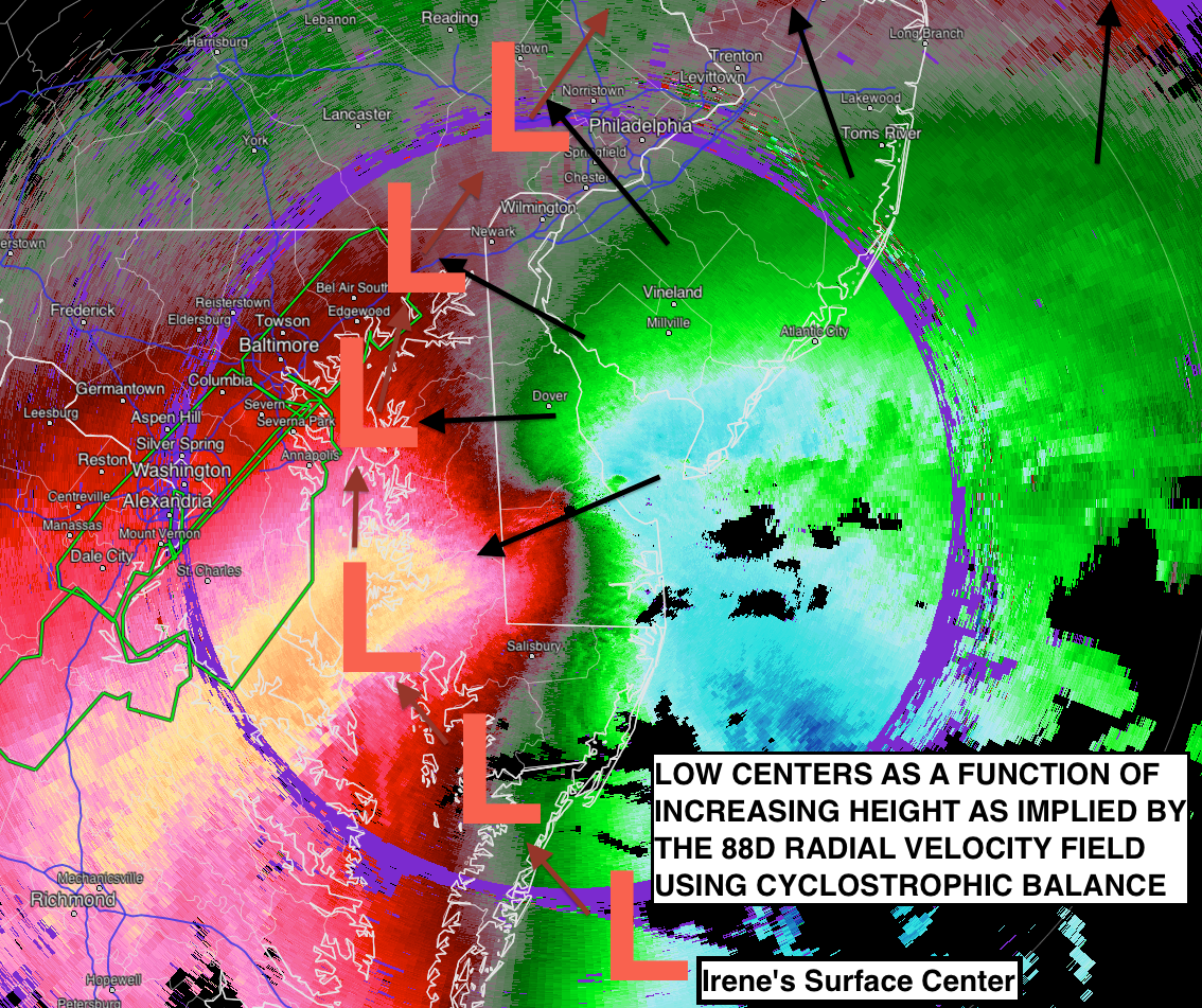
In a radial velocity image, the wind is either toward or away from a point (in this case the point is the Doppler radar). In the image below the doppler radar is the black dot in the center of the image. Pixels that are green to blue in color depict air that is moving directly toward the radar with green pixels indicating slower motion than blue. Pixels that are red to orange in color depict air that is moving directly away from the radar with red pixels indicating slower motion than orange. Pixels that are grey in color indicate air that has no component of motion toward the radar. This does not mean that the air is not moving!. It simply means that the air is not moving toward the radar. It might be moving very quickly, but is completely parallel perpendicular to the radar beam! Utilizing this fact, the giant grey “S” like shape down the middle of the image means that the wind is predominantly parallel perpendicular to the radar beam at that location. The black arrows indicate the wind direction along the grey “S” like shape.

One other fact to remember about radar interpretation is that because the earth is curved, the radar beam actually increases in height as it moves away from the radar itself. Thus in the image below, areas near the periphery of the image are at a higher altitude than areas near the center. Combining this fact with the wind directions from the black arrows, we can infer that the wind is changing direction from east-northeast at the surface to almost due south at some higher altitude.

Before I'm bombarded with complaints, I do not mean to imply that the center of Irene is located at each of the L's exactly. It is merely an approximation of where the center may be with increasing height based on the cyclostrophic balance. Other forces are at play, especially since the cyclone is transitioning from tropical to extra-tropical.

Now, let’s think back to the heat engine process described above. If the tropical cyclone is “vertically stacked”, and we assume the wind is cyclostrophic (meaning it is perfectly circular) about the center of the tropical cyclone (which is a good first order approximation), the wind would be in the same direction no matter what height we examined! If we looked at a radial velocity image, the grey “line” would be a straight! This is not the case with Irene. In fact, using the cyclostrophic balance, we can determine the approximate tilt with height of the center of Irene. This is denoted by the giant “L” on the image above. (The short arrows between “L” locations indicates the path from surface to higher altitudes.)

This tilt with height indicates that Irene will most likely not strengthen (at least not significantly) as it moves back over the ocean. Furthermore, this tilt with height probably indicates that Irene is undergoing a transition from a tropical cyclone to an extra-tropical cyclone. However, discussion of the differences in the types of cyclone and the transition process will be left to a future blog post.
Update: Thanks to reader SRHelicity, a major typo has been identified and corrected. The initial version of this post said they grey S shape in the radial velocity image indicated the wind was parallel to the radar beam. It should have read that the wind was perpendicular to the radar beam. The original figure was correct and needed no change.

The NWS’ Sounding Paradox

The NOAA National Weather Service (NWS) Headquarters has issued a directive that all sounding sites in the southern, central, and eastern regions (along with Montana) are to launch soundings every 6-hours until further notice. The idea here is that the additional upper-air data will help improve numerical forecasts of hurricane Irene — and I fully agree. Ultimately, better observations being ingested into the model guidance should help model forecasts, as well as the NOAA National Hurricane Center with their forecast of the all-important question: Does Irene make landfall somewhere along the densely populated east coast of the United States? (I’ve listed the message below for your reading pleasure.)

So what’s the paradox? For years now the satellite community, as well as some inside the NWS, have argued that NWS Radiosonde (sounding) Program should be scrapped in favor of using satellite derived soundings — especially for numerical forecasts!. In fact, due to recent budget issues inside the federal government, every year there is talk of cutting, or drastically scaling back, the NWS Radiosonde Program in favor of satellite derived soundings. So here is my question:

If the satellite derived soundings are so good, why does the NWS feel the need to have 6-hourly launches for the foreseeable future to improve the numerical guidance of Irene?

I happen to work very closely with another national center that I’m sure would love to have daily 6-hourly soundings to help with their forecast responsibilities…

EDIT (0240 UTC, 25 August 2011): Don’t get me wrong, satellites have their place in aiding forecasters. However, nothing can take the place of observations, and the actions by the NWS speak louder than anything I could say.

000
NOUS42 KWNO 242215
ADMNFD

SENIOR DUTY METEOROLOGIST NWS ADMINISTRATIVE MESSAGE NWS NCEP CENTRAL OPERATIONS CAMP SPRINGS MD 2214Z WED AUG 24 2011

NWSHQ DIRECTIVE TO LAUNCH SIX-HOURLY RAOBS /SOUNDINGS/...

SDM IS HEREBY RELAYING A DIRECTIVE FROM NWSHQ FOR WFO/S IN ALL OF EASTERN..SOUTHERN AND CENTRAL REGIONS PLUS MONTANA IN WESTERN REGION TO LAUNCH SIX-HOURLY RAOBS /SOUNDINGS/ BEGINNING AT THU 25 AUG 06Z AND UNTIL FURTHER NOTICE. THIS DIRECTIVE IS TO PROVIDE ADDITIONAL DATA INPUT WHICH SHOULD HELP WITH MODEL GUIDANCE IN FORECASTING THE FUTURE TRACK AND IMPACTS OF HURRICANE IRENE.

$$

STOUDT/SDM/NCO/NCEP

Forecast Soundings: A Look to the Future

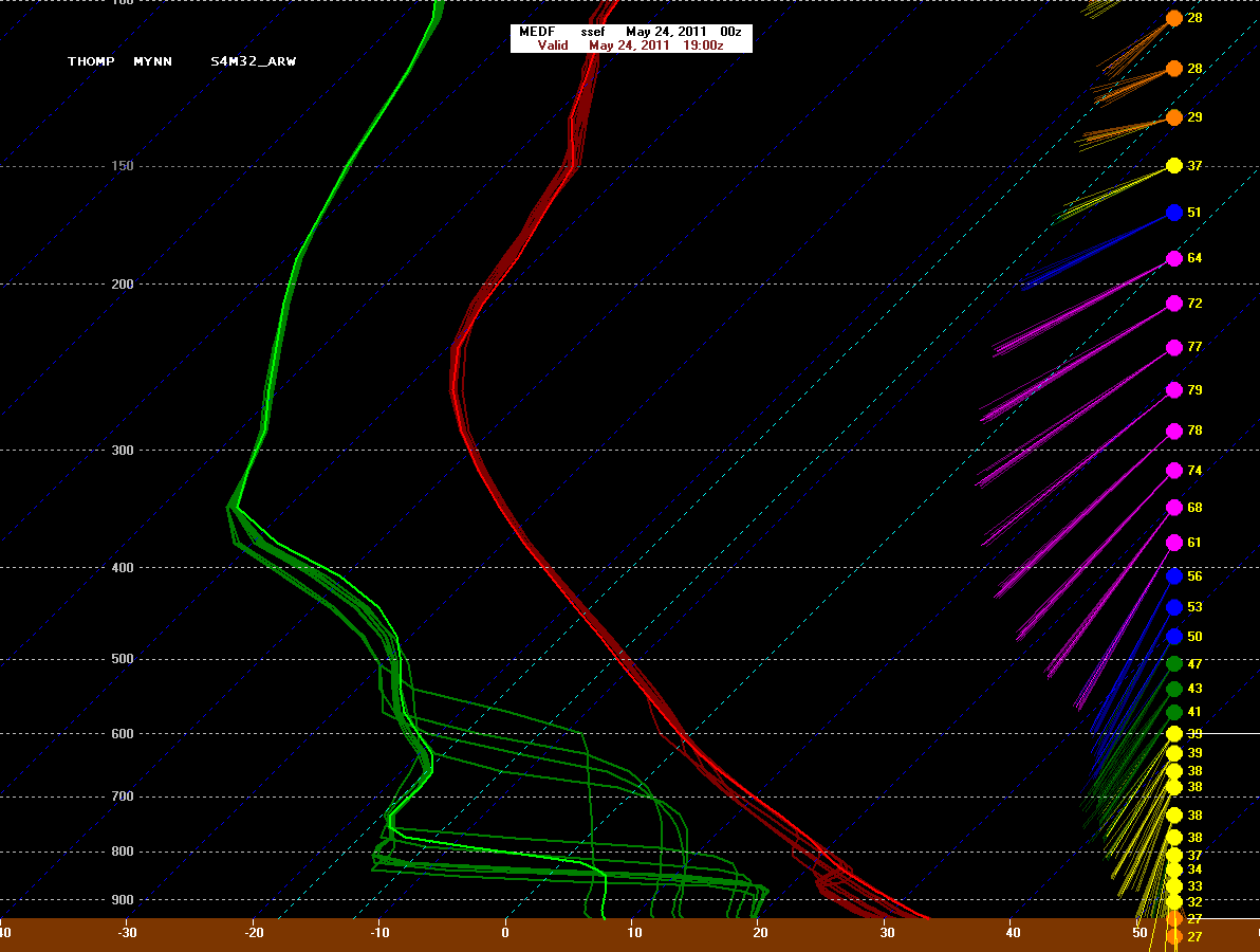
Those who are regular readers of this blog know by now that my research interests are centered on operational meteorology, data visualization, and data mining. For the 2011 Hazardous Weather Testbest (HWT) Experimental Forecast Program (EFP), I was able to combine my interests by creating a means of viewing model forecast soundings from various convection-allowing models, for the same location, simultaneously. Now, I didn’t create the viewing tool, but created a way to properly format millions of lines of data to utilize the BUFKIT sounding program. An example of one of these ensemble soundings is shown below.

As you can see, the ensemble sounding illustrates several different forecast scenarios that are not apparent when looking at a single sounding. In severe weather forecasting, these sometimes subtle differences in an atmospheric profile can lead to vastly different results. By looking at an ensemble of solutions, forecasters can begin to gauge the variability of the numerical guidance, as well as the predictability. Researchers also benefit. In the HWT this year, we learned about how different model physics impact the atmospheric profile, which, in turn, might introduce systematic biases into the forecast. Knowing this allows researchers to develop better ensembles and better models.

Creating this data set was not an easy process. I had to read in text-files containing the sounding information (example located at the end of the post) for each forecast sounding points — 1146 per model — in each of the 18 numerical models. At that point I needed to be able to compute various thermodynamic parameters from the soundings, so I rewrote most of the thermodynamic and kinematic routines in the Storm Prediction Center’s (SPC) sounding viewer, NSHARP (National Skew-T and Hodograph Analysis and Research Program), in Python. This allowed me to compute a thermodynamic and kinematic parameters in a wide variety of ways for the HWT-EFP, all consistent with what Storm Prediction Center forecasters are used to using in operations.

After computing the necessary thermodynamic fields, I then created sounding files in BUFKIT format for each of the 1146 sounding sites for each of the 18 models. Lastly, I combined the 18 model forecasts for each of the 1146 sites into a single file and output 1146 more text files containing the ensemble sounding files which could then be read by E-BUFKIT. A sample image is above. All-in-all this took about 1 hour of computation time on 18 separate computers. That’s a lot of data to crunch through!

After doing this for the HWT-EFP, I thought to myself, “Why stop there?”. Since the end of the EFP, and with the help of John Hart of the Storm Prediction Center, I have begun work on creating an ensemble sounding viewer — written entirely in Python — based on the SPC’s sounding program (NSHARP). Why Python? Because Python allows the program to be cross-platform, meaning anyone who installs Python on their computer can use the program.

The ultimate goal is to create this program and then release it to the atmospheric community as an open source project. This would allow researchers, forecasters, and hobbyists to be able to use the program to view model soundings in both a deterministic and ensemble framework. Additionally, by having a community supported sounding tool, it is my hope that researchers in the climate community will also use this program for their research. If the meteorology community adopts a single sounding tool, scientists, forecasters, and hobbyists will be able to quickly compare parameters from climate models, weather models, and observational data, knowing that the values were computed in the same manner. This would be a huge boost to comparing historical, current, and future events. Not to mention allow for consistency between datasets.

I’m still in the early stages of development. My hope is to be able to present an alpha version of this program at the American Meteorological Society’s Annual Meeting in New Orleans next January. I’ll have my work cut-out for me…

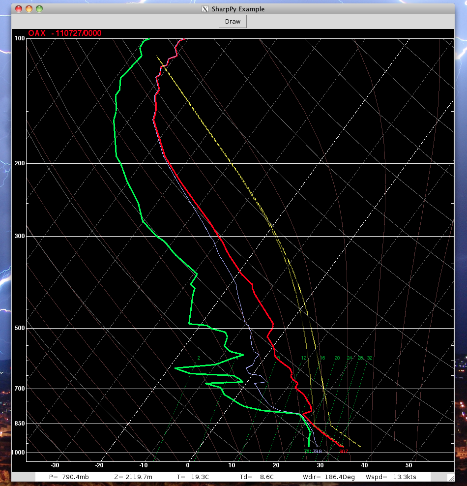
In the mean time, a screen shot from this new sounding tool is shown below. This prototype supports active read-out, with on-the-fly interpolation as one moves the mouse over the sounding. The read-out is listed at the bottom of the sounding.

I’m interested in knowing what people think, so feel free to leave me feedback!

Sample Sounding Text File

Visual Comparison: 3-4 April 1974 and 27-28 April 2011

By the afternoon of 28 April 2011 it was fully apparent that the unthinkable had happened. In an era of unprecedented communication abilities, a single tornado outbreak took the lives of more people than all the tornadoes over the past several years combined – in broad daylight no less. In the days the followed, many tried to place this event into historical context. Nearly every one defaulted to the 3-4 April 1974 “Super Outbreak”.

The Super Outbreak was nothing short of impressive from a meteorological point of view. 148 tornadoes, 319 fatalities, over 13-states, in 24-hours. Never before, and not until this April, had anything even close to the scale of this tornado outbreak had ever been recorded. By comparison, the tornado outbreak of 27-28 April 2011 has an unofficial count (undertaken by several of us at the Storm Prediction Center) of over 174 tornadoes (done via Public Information Statements) and 259 fatalities attributed to these tornadoes. (Unfortunately, the death toll is considerably higher, I simply have been unable to place all the fatalities to the corresponding tornado at this time.)

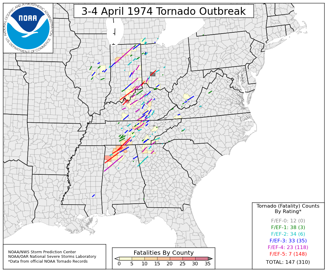
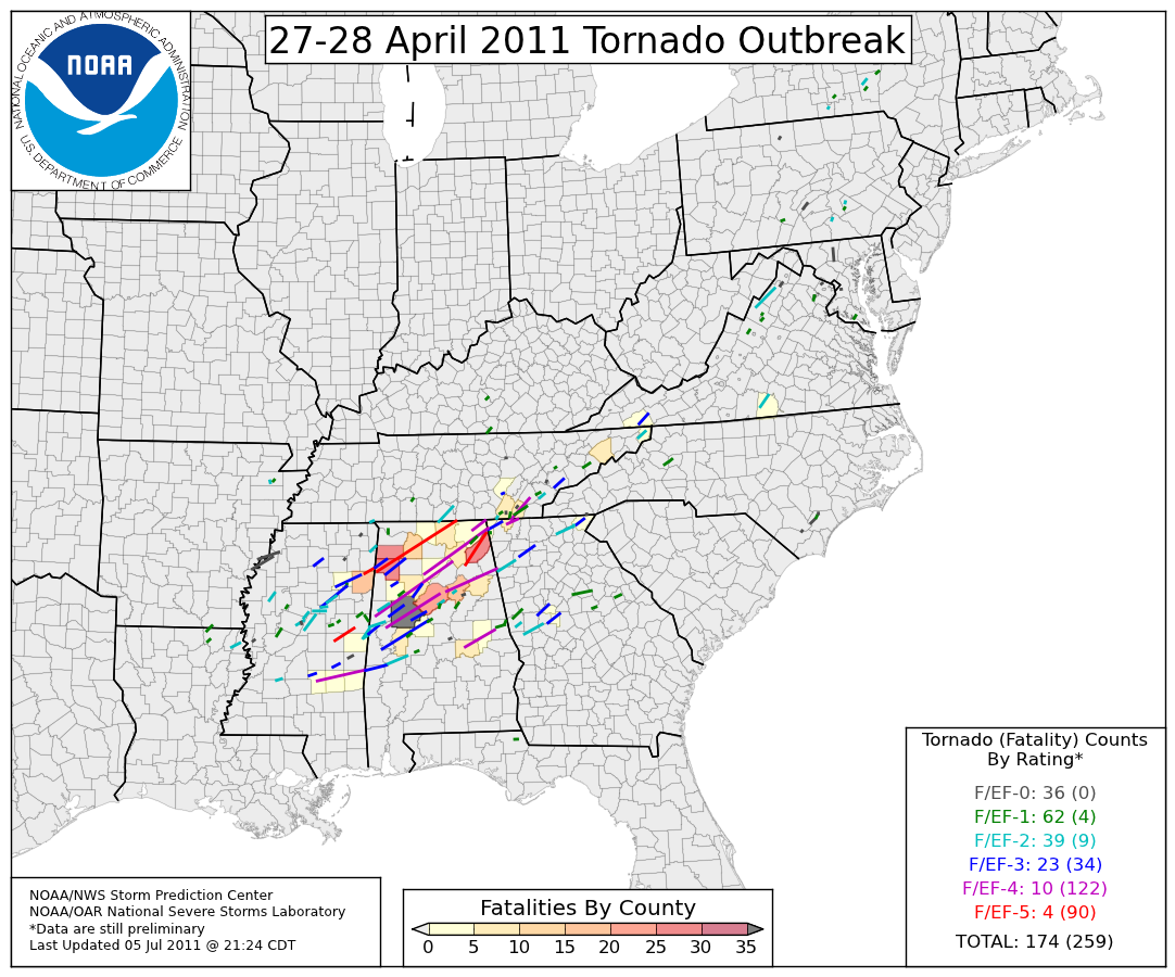
From the standpoint of the number of tornadoes recorded and the number of fatalities, these two tornado outbreaks are in a class by themselves (in the “modern” tornado database starting in 1950). In the days that followed, I created a set of figures for internal NWS/SPC/NSSL use to compare the two tornado outbreaks. The images show all reported tornado tracks, color coded based on intensity and the counties are color-filled based on the number of fatalities that occurred within that county’s boundaries. A simple, quick look through the two events shows that the 3-4 April 1974 event covered a much larger area than the 27-28 April 2011 event, although there is considerable overlap between the two events. Several counties experienced fatalities in both events; in fact, Marion County, Alabama was unfortunate to have had a F/EF-5 tornado, and large loss of life, in both of outbreaks (1974: Guin, AL; 2011: Hackleburg, AL). Lastly, each figure has a table of the number of tornadoes and corresponding fatalities, broken down by EF-Scale (the 2011 event is still “preliminary” and subject to change). (Note, higher resolution images, for “zooming” are available by request.)

Meteorologists (and others) can, and will, debate for years as to which event was “more impressive”. I know what my thoughts are, but I’ll spare you those. However, please feel free to leave your thoughts in the comments.

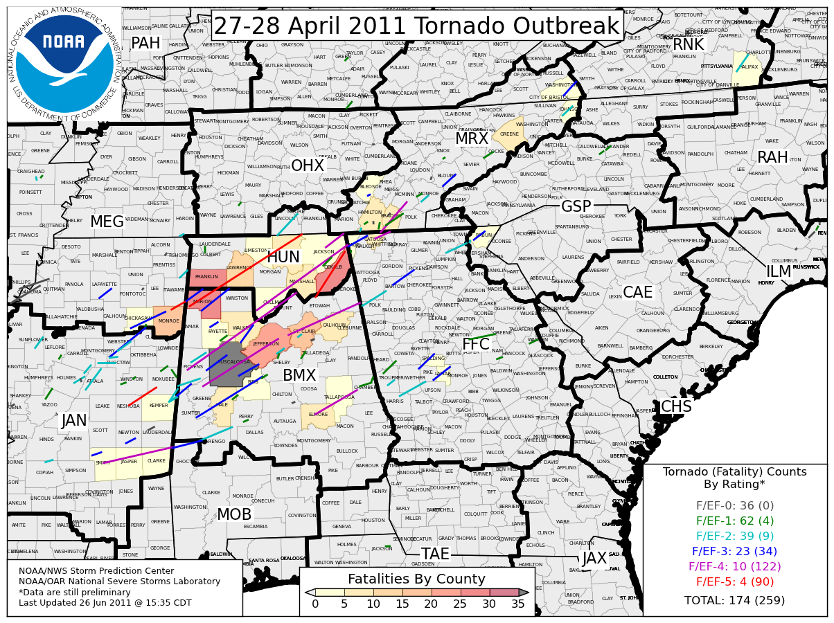
The two images above are on the same background. This means if you download both of them and flip back and forth between the two, the only things that should change are the county colors and tornado tracks. Below is a zoomed in version of the 27-28 April 2011 event, complete with NWS County Warning Areas and County Names denoted.

Long Hiatus Ends

A lot has taken place the last few months and this has prevented me from being able to blog. Since my last post the United States has experienced a devastating tornado outbreak (27 April 2011 in the southeast), the deadliest tornado since 1947 (22 May 2011 in Joplin, MO), and a violent tornado outbreak in the more tradition area of Oklahoma (24 May 2011). What makes this year remarkable is the number of tornadoes that have hit heavily populated areas, which has contributed to the number of direct tornado fatalities being well over 500. It’s certainly been an emotional year for meteorologists. Also during my blogging hiatus, the National Severe Storms Laboratory and the Storm Prediction Center held another successful Experimental Forecast Program. The datasets generated will provide researchers ample opportunities for discovery.

This post is short, but serves to end my blogging drought. In the coming days, weeks, and months, I hope to share what’s been keeping me busy. Here’s to getting back into the habit of putting my thoughts in words.